
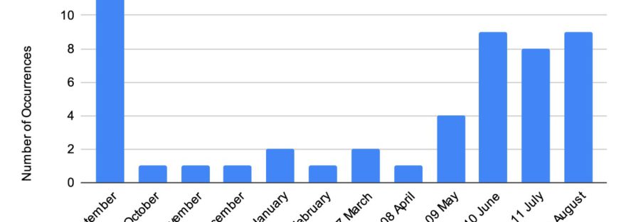
Our market advisor periodically publishes a histogram that shows how many times a marketing year high in corn or soybeans has occurred in each month, starting with the 1970/1971 marketing year.
I won’t republish their exact chart, but this graph is created using the same data.
The last time I looked at their histogram, I noticed how many of the data points in the September corn column were from the 1970s and 1980s. A lot has changed since then- South American production, changing weather patterns, more information technology at the USDA- and I wondered if the timing of the marketing year highs have shifted over time.
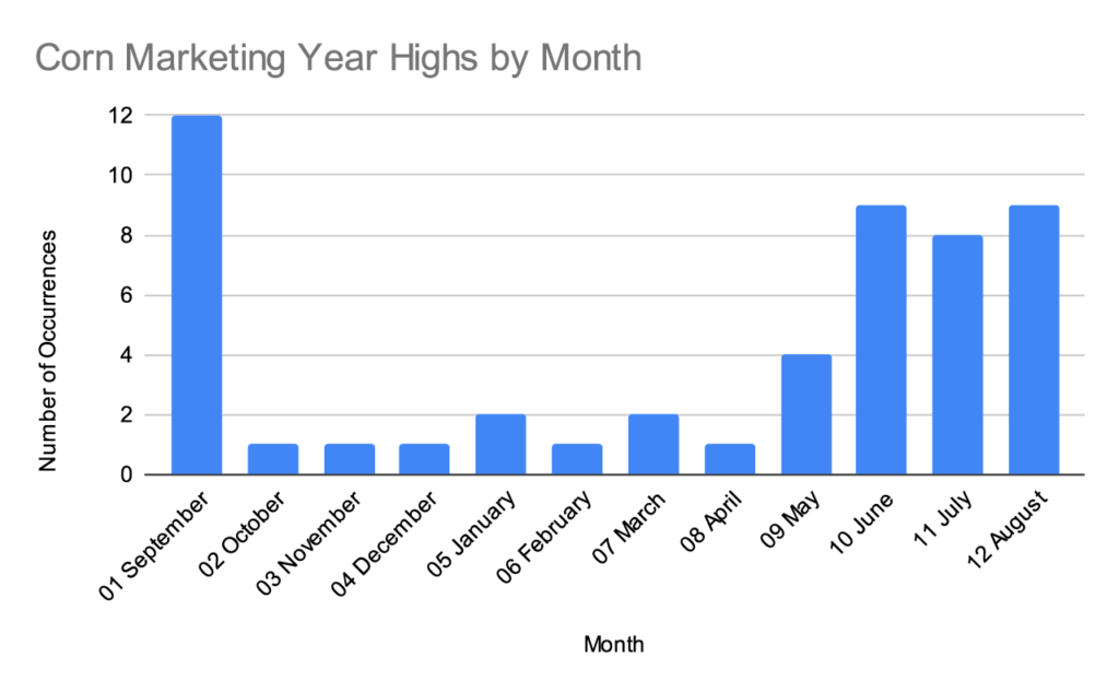
This was hard to visualize in their histogram, so I typed the data into my own spreadsheet and made a split bar graph to compare 1980-1999 with 2000-2019.
Corn
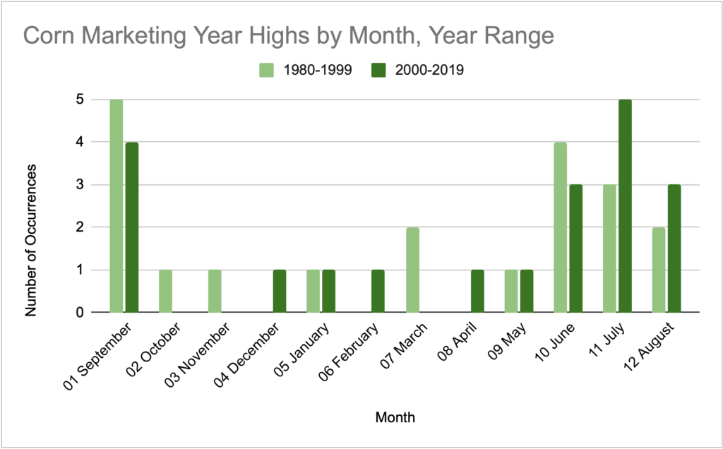
Nothing wildly different here. The most notable change is the decrease in highs in September and the increase in July.
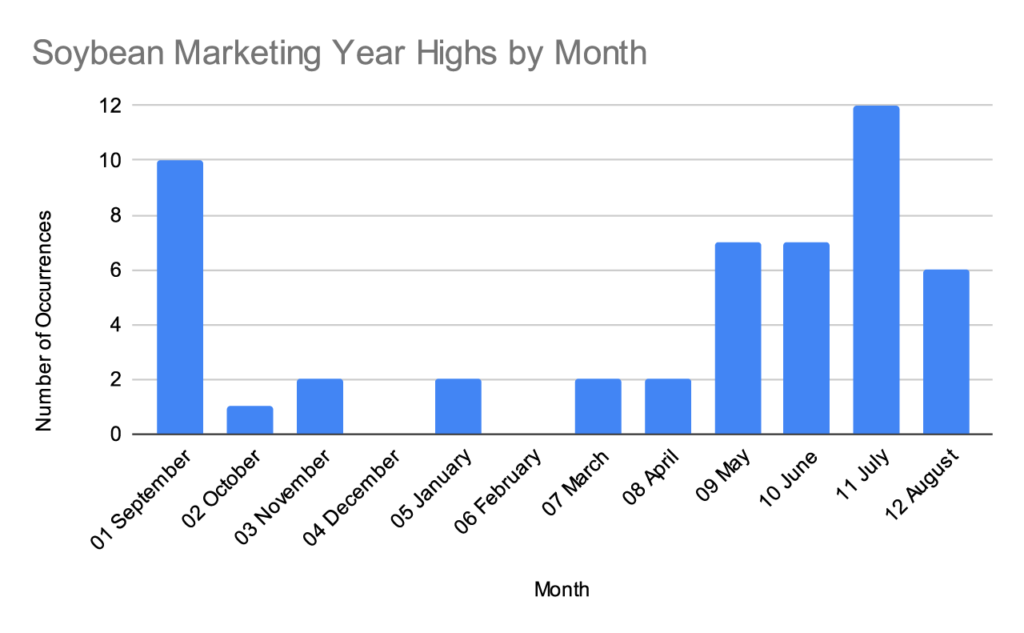
Soybeans
For consistency with the first corn graph provided, here’s a soybean graph starting at 1970.
Then here’s the 20 year comparison.
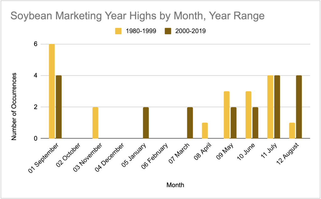
If you’d like to approach this soybean chart with a South American narrative, it will support it. In the last 20 years you see a flattening of the seasonal pattern and the emergence of a few highs in January and March.
Raw Data
Attached is a CSV of the data if you’d like to dig deeper. This is technically cash price data for central Illinois so there could be some basis slippage to board prices.
Note: the Crop Year column is a single year and refers to the first year in the marketing year. (2020 Crop Year = 2020/2021 Marketing Year). I prefer working with 1 year in the raw data and converting back to a readable form as needed.