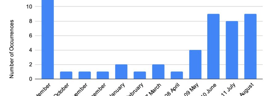
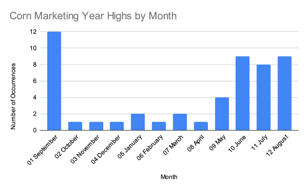
Our market advisor periodically publishes a histogram that shows how many times a marketing year high in corn or soybeans has occurred in each month, starting with the 1970/1971 marketing year.
I won’t republish their exact chart, but this graph is created using the same data.
Full data set since 1970
The last time I looked at their histogram, I noticed how many of the data points in the September corn column were from the 1970s and 1980s. A lot has changed since then- South American production, changing weather patterns, more information technology at the USDA- and I wondered if the timing of the marketing year highs have shifted over time.
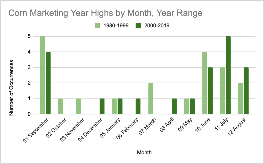
This was hard to visualize in their histogram, so I typed the data into my own spreadsheet and made a split bar graph to compare 1980-1999 with 2000-2019.
Corn
Nothing wildly different here. The most notable change is the decrease in highs in September and the increase in July.
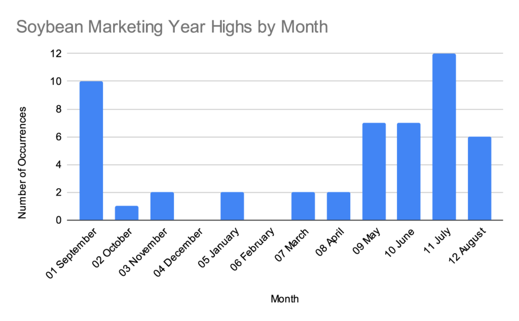
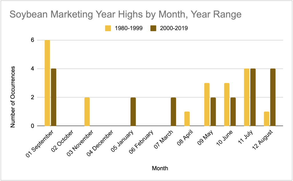
Soybeans
For consistency with the first corn graph provided, here’s a soybean graph starting at 1970.
Then here’s the 20 year comparison.
If you’d like to approach this soybean chart with a South American narrative, it will support it. In the last 20 years you see a flattening of the seasonal pattern and the emergence of a few highs in January and March.
Raw Data
Attached is a CSV of the data if you’d like to dig deeper. This is technically cash price data for central Illinois so there could be some basis slippage to board prices.
Note: the Crop Year column is a single year and refers to the first year in the marketing year. (2020 Crop Year = 2020/2021 Marketing Year). I prefer working with 1 year in the raw data and converting back to a readable form as needed.
If you engage in any direct-to-consumer agriculture, you’ll need a point of sale system to process credit card payments, track sales, etc. Square is a popular choice for many small businesses and is what we’ve used with our strawberry/blueberry patch.
While Square’s built-in reports provide a decent insight into overall performance, I had trouble drilling down to item-specific performance over varying periods of time like hour of day, day of week, etc.
To answer these questions and guide setting business hours, I created a spreadsheet to answer 3 questions:
How many sales occurred in each hour of an average week (all weeks overlaid)
Was there a shift in popular hours as the season progressed?
What was the typical pattern of sales during the first weekend of a crop? How does that compare to the second, third, etc, or holidays.
I additionally created two item-specific reports to show the most popular hours of a day or days of a week for every item.
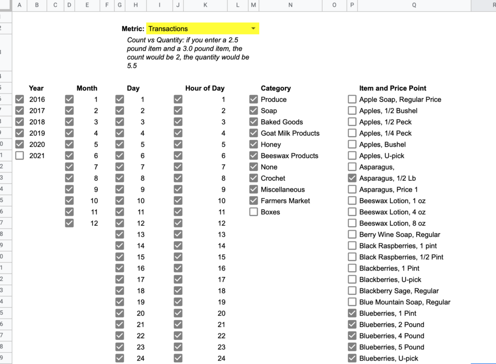
Spreadsheet Setup
I created this in Google Sheets. You can add a blank copy of this spreadsheet to your drive here
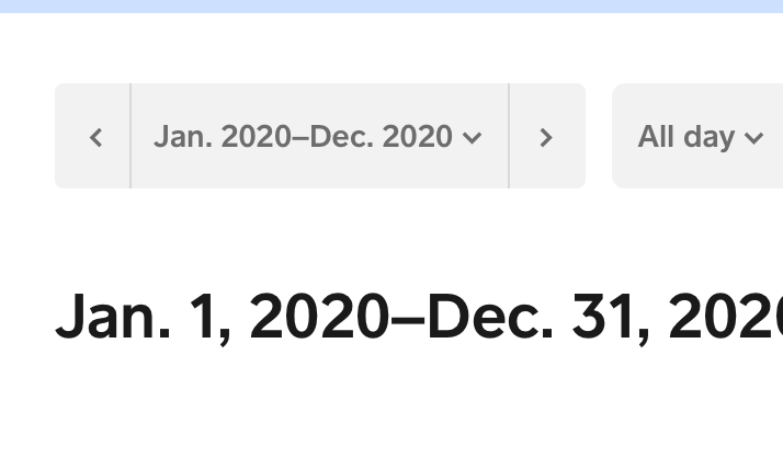
2. Then pick your timeframe for the data. The spreadsheet will allow you to filter by time period later, so unless you have a good reason to limit the input data, select an entire year at a time. (1 year is the maximum for one export)
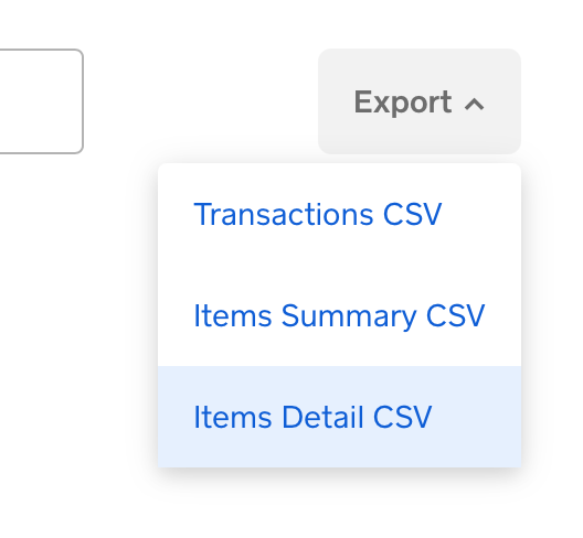
3. On the right side, click Export, and select Item Detail CSV
4. (Repeat this for as many years as you have data you want to be able to query)
Importing CSV Data to Spreadsheet
1. If you haven’t already, add a copy of the spreadsheet to your Google Drive via this link
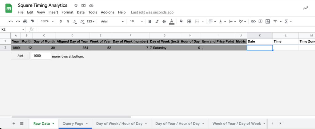
When you open the spreadsheet, you should land on the Raw Data sheet. Columns A – J are formula helper functions, so insert the Square data starting at column K.
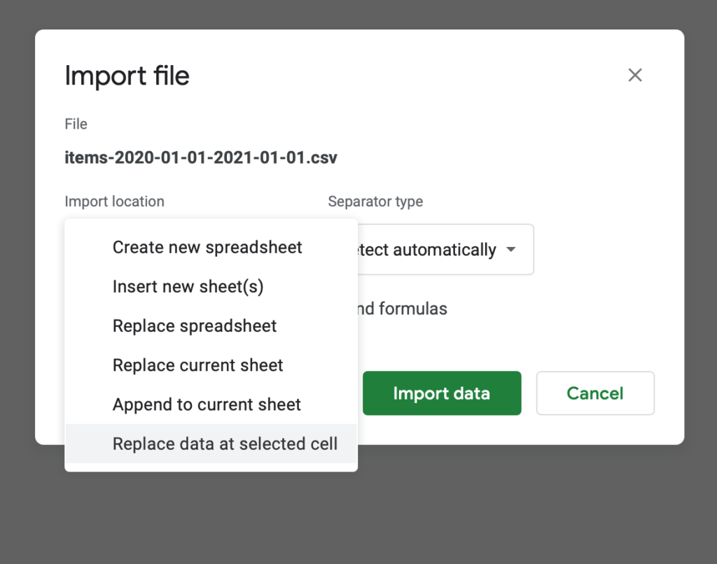
2. With K2 selected, go to File > Import > Upload, and select the CSV you downloaded from Square.
3. After the file uploads, you should see the Import file modal. For import location, select “Replace data at selected cell”. Everything else can be left as is. Click import data.
You’ll notice that the first row of the inserted data contains column labels. Double check that these map to the existing labels in the top row (but don’t delete this row yet, it has formulas that need to be copied). Square has not changed their column format in the two years since I first made this spreadsheet, but you never know. ¯\_(ツ)_/¯
4. You’ll need to copy the formulas in A2 – J2 to all the rows below. The most reliable way to do this at scale is to select A2 – J2, and copy. Then select A3, scroll all the way to bottom of the sheet, hold Shift, and select the bottom cell in column J. Now do a regular paste. This should apply the formula across all the cells without having to drag and scroll down potentially thousands of rows.
5. Delete the header row at A2.
6. Repeat this process for each CSV you need to import and remember to delete the column headings each time
Go to the Query Page sheet when you’re finished. If all has gone well, you should see each year you’ve imported under the Year list, and you should see your product categories and items/price points under the respective lists. Now you’re ready to use the querying page and reports.
Using the Spreadsheet
Query page- start here
Query Page is what you’d expect- a landing page to select filters on what data you want to view. The checkbox to the left of each item includes/excludes it from the data. Depending on the size of your dataset and the kind of device you’re viewing from, filter applications could take a bit to apply, although I’m usually under a 5 second digest time with my 19,000 row dataset on a decent laptop.
The Metric dropdown controls what numbers are used in the reports: count, quantity, revenue, or transactions.
Once you’ve picked the metric you want to see and selected/unselected your filters, you can visit any of the subsequent report pages and those filters will already be applied.
These reports are all two-dimensional matrices with conditional formatting across the matrix to highlight highs/lows. There is some repetition and overlap between reports, but I’ll step through each report so you can see what each does well.
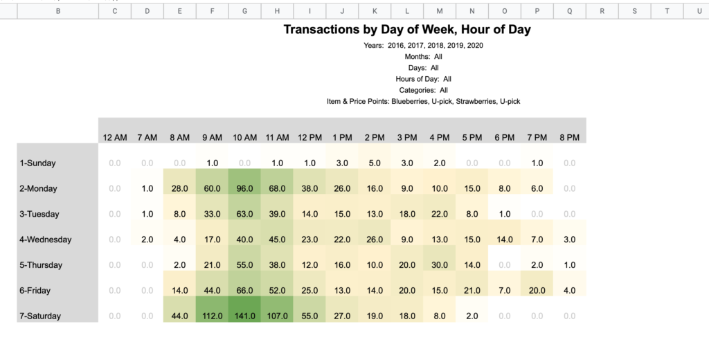
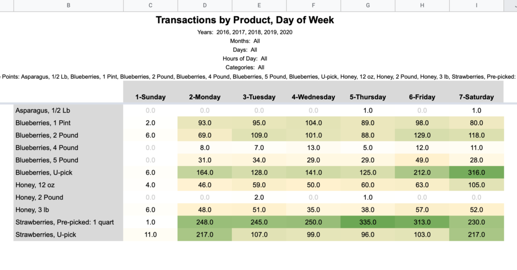
Day of Week / Hour of Day
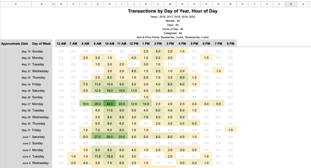
Note that the hours noted in these column headings mean the hour portion of the time. For example, 2 PM accounts for all sales from 2:00 – 2:59 PM.
Day of Year / Hour of Day
The left axis in this view is first aligned by day of week and week of year. Then after the fact, Approximate Date is calculated for an average calendar date. In our business “a Saturday in late May” means more than a literal date like “May 27th”. I’d guess this is the case for many businesses and thus being weekday centric makes sense for fair interyear comparisons.
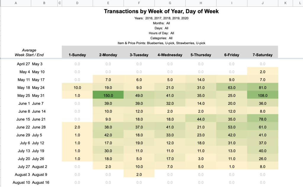
Week of Year / Day of Week
Think of this like a calendar with columns as days and rows as weeks. The same date fuzziness is at play here since these are aligned by week of year. The start/end dates listed on the left are averages, not extremes.
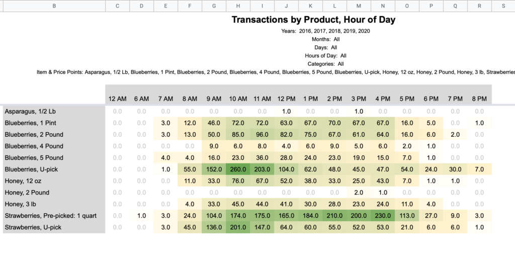
Product / Hour of Day
Product / Day of Week
Expansion
The report pages all reference the hidden Filtered Data sheet which is generated by applying the Query Page filters to the Raw Data sheet. If you’d like to build your own reports, referencing this Filtered Data sheet will allow you piggyback off all the built-in querying.
Pivot Table Weirdness
In this project I discovered how pivot tables in Google Sheets misbehave when the source data is changed. Specifically, if you have conditional filters applied, then delete and insert fresh data to the data range, the pivot table will not process the data until you remove and reapply the filters. I ended up rewriting my report pages (which originally used pivot tables) with a manual SUMIFS matrix so that it would reliably work when copied and populated with someone’s new data. This also drastically sped up the digest time of queries (I had load times of 60+ seconds on my 19,000 row dataset, down to under 5 seconds with the bare SUMIFS matrices).
I never went back to test a pivot table on the Filtered Data sheet as that method of filtering postdated the use of pivot tables, but you may encounter problems on reloads.
One of the first resources I found in my quest to quantify the local basis market was this dataset from the University of Illinois. It provides historical basis and cash price data for 3 futures months in 7 regions of Illinois going back to the 1970s.
On its own, I haven’t found any region in this dataset to be that accurate for my location. Perhaps I’m on the edge of two or three regions, I thought. This got me thinking- what if I had the actual weekly basis for my local market for just a year or two and combined that with the U of I regional levels reported for the same weeks? Could I use that period of concurrent data to calibrate a regression model to reasonably approximate many more years of historical basis for free?
I ended up buying historical data for my area before I could full test and answer this. While I won’t save myself any money on a basis data purchase, I can at least test the theory to see if it would have worked and give others an idea for the feasibility of doing this in their own local markets.
Regression Analysis
If you’re unfamiliar with regression analysis, essentially you provide the algorithm a series of input variables (basis levels for the 7 regions of Illinois) and a single output to find the best fit to (the basis level of your area) and it will compute a formula for how a+b+c+d+e+f+g (plus or minus a fixed offset) approximates y. Then you can run that formula against the historical data to estimate what those basis levels would have been.
We can do this using Frontline Solver’s popular XLMiner Analysis Toolpak for Excel and Google Sheets. Here‘s a helpful YouTube tutorial for using the XLMiner Toolpak in Google Sheets and understanding regression theory, and here’s a similar video for Excel.
Input Data Formatting
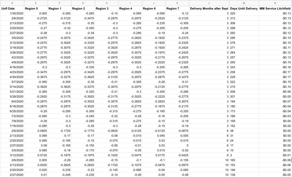
You’ll want to reformat the data with each region’s basis level for a given contract in separate columns (Columns E-K below), then a column for your locally observed values on/near those same dates (Column N). To keep things simple starting out, I decided to make one model that includes December, March, and July rather than treat each contract month as distinct models. To account for local-to-regional changes that could occur through a marketing year, I generated Column L to account for this, and since anything fed into this analysis needs to be numerical, I called it “Delivery Months after Sept” where December is 3, March is 6, and July is 10. I also created a “Days Until Delivery” field (Column M) that could help it spot relationship changes that may occur as delivery approaches.
Always keep in mind: what matters in this model isn’t what happens to the actual basis, but the difference between the local basis and what is reported in the regional data.
⚠️ One quirk with the Google Sheet version- after setting your input and output cells and clicking the OK button, nothing will happen. There’s no indication that the analysis is running, and you won’t even see a CPU increase on your computer as this runs in Google’s cloud. So be patient, but keep in mind there is a hidden 6 minute timeout for queries (this not shown anywhere in the UI, I had to look in the developer console to see the API call timing). If your queries are routinely taking several minutes, set a timer when you click OK and know that if your output doesn’t appear within 6 minutes you’ll need to reduce the input data or use Excel. In my case, I switched to Excel part way through the project because I was hitting this limit and the 6 minute feedback loop was too slow to play around effectively. Even on large datasets (plus running in a Windows virtual machine) I found Excel’s regression output to be nearly instantaneous, so there’s something bizarrely slow about however Google is executing this.
Results & Model Refinement
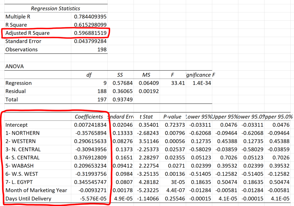
For my input I used corn basis data for 2018, 2019, and 2020 (where the year is the growing season) which provided 9 contract months and 198 observations of overlapping data between the U of I data and my actual basis records. Some of this data was collected on my own and some was a part of my GeoGrain data purchase.
Here’s the regression output for the complete dataset:
The data we care most about is the intercept (the fixed offset) and the coefficients (the values we multiply the input columns by). Also note the Adjusted R Squared value in the box above- this is a metric for measuring the accuracy of the model- and the “adjustment” applies a penalty for additional input variables since even random data can appear spuriously correlated by chance. Therefore, we can play with adding and removing inputs in an attempt to maximize the Adjusted R Squared.
0.597 is not great- that means this model can only explain about 60% of the movement seen in actual basis data by using the provided inputs. I played around with adding and removing different columns from the input:
Data
Observations
Adjusted R Squared
All Regions
198
0.541
All Regions + Month of Marketing Year
198
0.596
All Regions + Days to Delivery
198
0.541
All Regions + Month of Mkt Year + Days to Delivery
198
0.597
Regions 2, 6, 7, + Month of Mkt Year + Days to Delivery
198
0.537
Regions 1, 3, 4, + Month of Mkt Year + Days to Delivery
198
0.488
All Data except Region 3
198
0.588
December Only
95
0.540
March Only
62
0.900
July Only
41
0.935
December Only- limited to 41 rows
41
0.816
Looking at this, you’d assume everything is crap except the month-specific runs for March and July. However, it seems like a good part of those gains can be attributable to the sample size though as shown in the December run limited to the last 41 rows, a comparable comparison to the July data.
Graphing Historical Accuracy
While the error metrics output by this analysis are quantitative and helpful for official calculations, my human brain finds it helpful to see a graphical comparison of the regression model vs the real historical data.
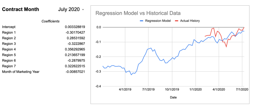
I created a spreadsheet to query the U of I data alongside my actual basis history to graph a comparison for a given contract month and a given regression model to visualize the accuracy. I’m using the “All Regions + Month of Marketing Year” model values from above as it had effectively the highest Adjusted R Square given the full set of observations.
In case it’s not obvious how you would use the regression output together with the U of I data to calculate an expected value, here’s a pseudo-formula:
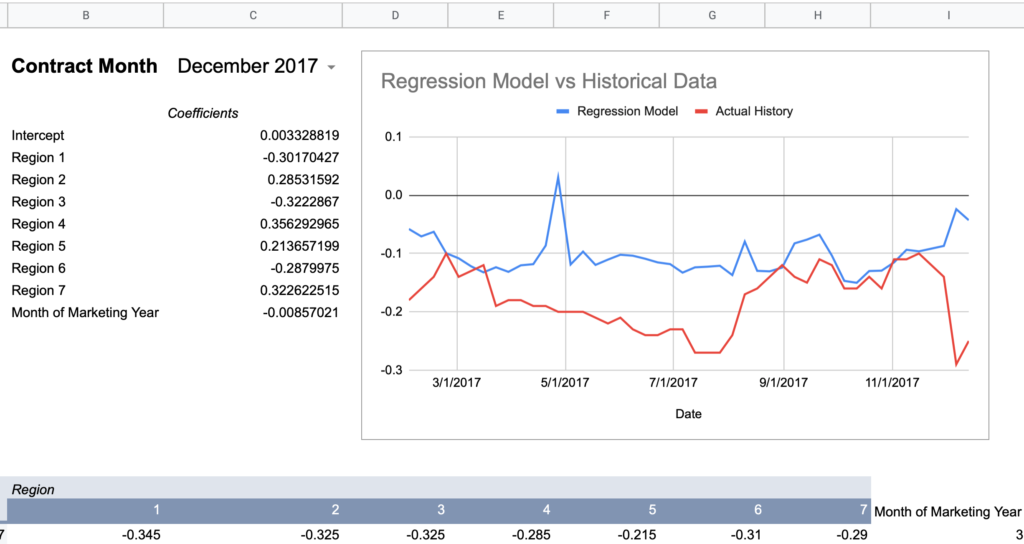
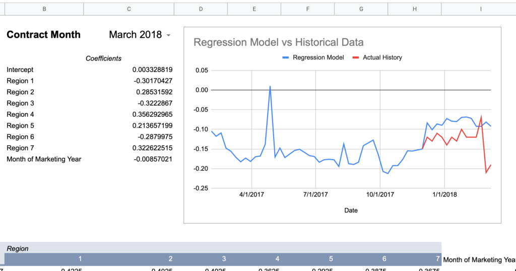
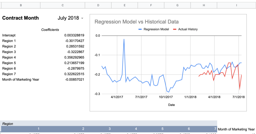
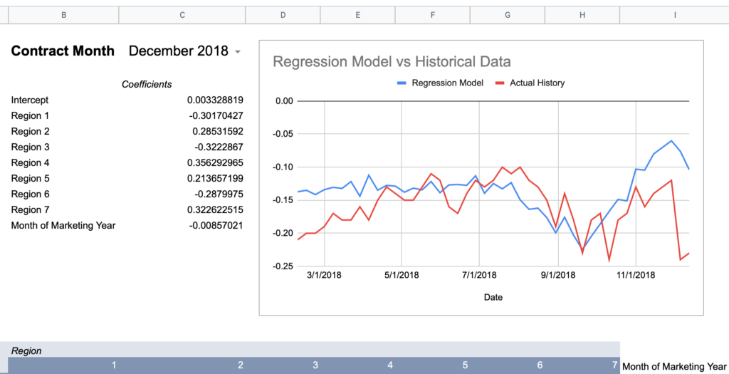
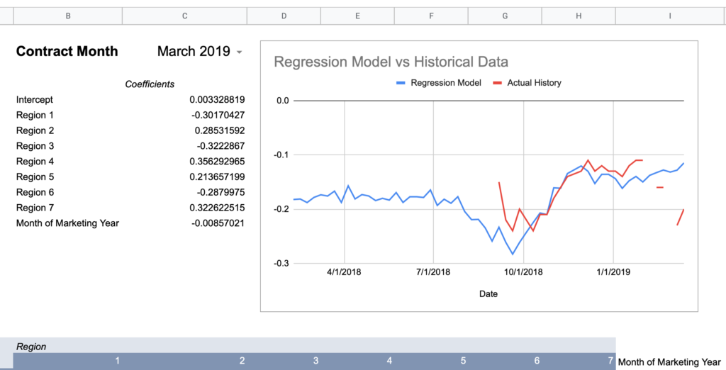
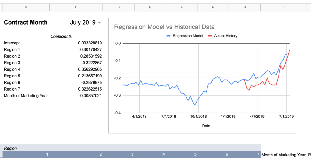
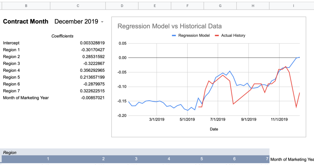
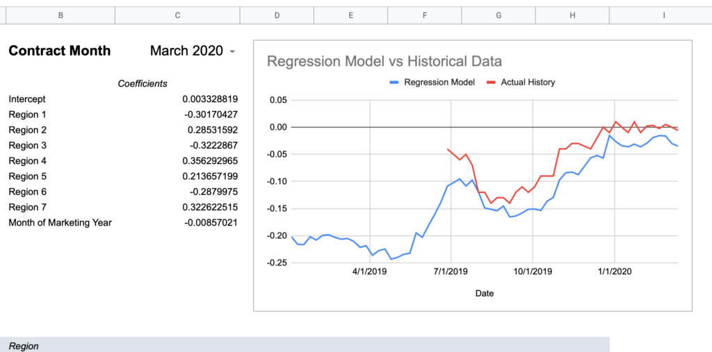
Now here are graphs for 2017-2019 contracts using that model:
Here’s how I would describe this model so far:
“60% of the time it works every time”
Keep in mind, the whole point of a regression model is to train it on a subset of data, then run that model on data it has never seen before and expect reasonable results. Given that this model was created using 2018-2020 data, 2017’s large errors seem concerning and could indicate futility in creating a timeless regression model with just a few years of data.
To take a stab at quantifying this performance, I’ll add a column to calculate the difference between the model and the actual value each week, then take the simple average of those differences across the contract. This is a very crude measure and probably not statistically rigorous, but it could provide a clue that this model won’t work well on historical data.
Contract Month
Average Difference
July 2021
<insufficient data>
March 2021
<insufficient data>
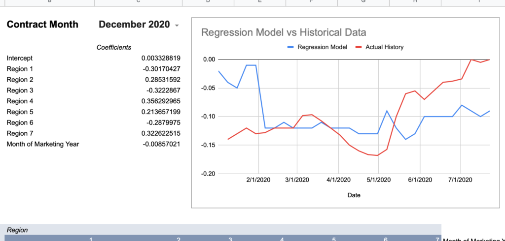
December 2020
0.05
July 2020
0.03
March 2020
0.04
December 2019
0.03
July 2019
0.05
March 2019
0.03
December 2018
0.04
– – – – – – –
– – – – – – – – – –
July 2018
0.04
March 2018
0.05
December 2017
0.08
July 2017
0.15
March 2017
0.06
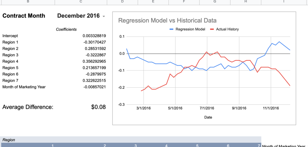
December 2016
0.08
July 2016
0.10
March 2016
0.06
December 2015
0.07
July 2015
0.07
March 2015
0.04
December 2014
0.07
The dotted line represents the end of the data used to train the model. If we take a simple average of the six contracts above the line, it is 4.3 cents. The six contracts below the line average 7.6 cents.
Is this a definitive or statistically formal conclusion? No. But does it bring you comfort if you wanted to trust the historical estimation without having the actual data to spot check against? No again.
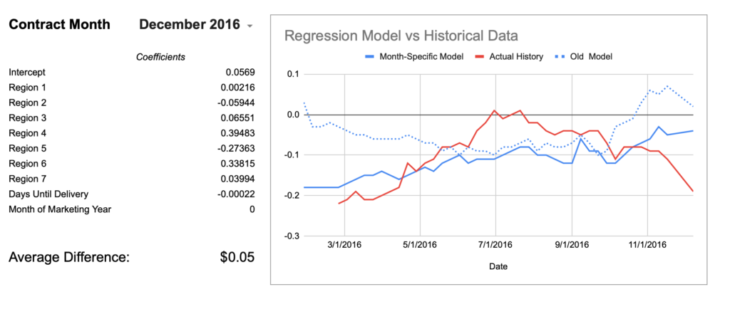
To provide a visual example, here’s December of 2016 which is mathematically only off by an average of $0.08.
How much more wrong could this seasonal shape be?
Conclusion: creating a single model with 2-3 years of data does not consistently approximate history.
Month-Specific Model
Remember the month-specific models with Adjusted R Squares in the 80s and 90s? Let’s see if the month-specific models do better on like historical months.
Contract Month
Average Difference (Old Model)
Average Difference (Month-Model)
July 2021
<insufficient data>
March 2021
<insufficient data>
December 2020
0.05
0.03
July 2020
0.03
0.02
March 2020
0.04
0.01
December 2019
0.03
0.03
July 2019
0.05
0.02
March 2019
0.03
0.02
December 2018
0.04
0.03
– – – – – – –
– – – – – – – – – –
– – – – – – –
July 2018
0.04
0.04
March 2018
0.05
0.03
December 2017
0.08
0.05
July 2017
0.15
0.11
March 2017
0.06
0.06
December 2016
0.08
0.05
July 2016
0.10
0.08
March 2016
0.06
0.08
December 2015
0.07
0.04
July 2015
0.07
0.04
March 2015
0.04
0.03
December 2014
0.07
0.05
Well, I guess it is better. ¯\_(ツ)_/¯ Using the month-specific model shaved off about 2 cents of error overall. The egregious December 2016 chart is also moving in the right direction although still not catching the mid-season hump.
Even with this improvement, it’s still hard to recommend this practice as a free means of obtaining reasonably accurate local basis history. What does it mean that July 2017’s model is off by an average of $0.11? In a normalized distribution, the average is equal to the median and thus half of all occurrences are above/below that line. If we assume the error to be normally distributed, that would mean half of the weeks were off by greater than 11 cents. You could say this level of error is rare in the data, but it’s still true that this has been shown to occur, so if you did this blind you have no great way of knowing if what you were looking at was even 10 cents within the actual history. In my basis market at least, 10 cents can be 30%-50% of a seasonal high/low cycle and is not negligible.
Conclusion: don’t bet the farm on this method either. If you need historical basis data, you probably need it to be reliable, so just spend a few hundred dollars and buy it.
Last Ditch Exploration- Regress ALL the Available Data
Remember how Mythbusters would determine that something wouldn’t work, but for fun, replicate the result? That’s not technically what I’m doing here, but it feels like that mood.
Before I can call this done, let’s regression analyze the full history of purchased basis data on a month-by-month basis to see if the R Squared or historical performance ever improves by much. I’ll continue to use the basis data for corn at M&M Service for consistency with my other runs. It also has the most data (solid futures from 2010-2020) relative to other elevators or terminals I have history for.
Here are the top results of those runs:
Month
Number of Observations
Adjusted R Squared
Standard Error
December
329
0.313
0.049
March
247
0.342
0.055
July
175
0.455
0.116
All Months Together
751
0.305
0.078
Final Disclaimer: Don’t Trust my Findings
It’s been a solid 6-7 years since my last statistics class and I know I’m throwing a lot of numbers around completely out of context. Writing this article has given me a greater appreciation for the disciplined work in academic statistics of being consistent in methodology and knowing when a figure is statistically significant or not. I’m out here knowing enough to be dangerous and moonlighting as an amateur statistician.
It’s also possible that other input variables could improve the model beyond the ones I added. What if you added a variable for “years after 2000” or “years after 2010” that would account for the ways regional data is reflected differently over time? What about day of the calendar year? How do soybeans or wheat compare to corn? The possibilities are endless, but my desire to bark up this tree for another week is not, especially when I already have the data I personally need going forward.
I’d be delighted for feedback about any egregious statistical error I committed here or if anyone get different results doing this analysis in their local market.
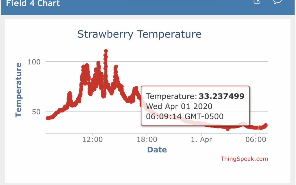
This project started while my wife and I were managing spring frost protection in our strawberry patch and trying to better understand how the temperature experienced at the bloom level compares to the air temperature reported by local weather stations on Weather Underground. In the year that has passed since building this temperature logger for that purpose, I’ve encountered several other scenarios where remotely monitoring a temperature can be really helpful:
Air temperature in a well pump house during a cold snap
Field soil temperature during planting season
Air temperature in a high tunnel to guide venting decisions
Whatever you might use this for, the fundamentals are application agnostic and the microcontroller board from Particle used in this project can be connected to a wide array of sensors if you’d like to expand down the road. This tutorial lays out of the basics to get up and running with a single temperature probe.
Waterproof DS18B20 temperature probe laying amongst strawberry plant
Particle: Internet-Connected Arduino
If you’re not familiar, Arduino is an open source, single board microcontroller with numerous general purpose input/output (GPIO) pins that allow for easy interfacing between the physical world and code. It might seem rudimentary, but working at the physical/virtual boundary can be really satisfying; of course code can make an object on screen move, and of course touching a motor’s wiring to a battery can make it move, but the ability to use code to manipulate something in the physical world is a special kind of thrill. Absent expansion modules, an Arduino is a standalone board whose software is loaded via a USB cable and cannot natively publish data to the internet.
Particle essentially takes the Arduino hardware, adds a wifi (or cellular) internet connection, and marries it to their cloud software to create an easy to use, internet connected microcontroller. Not only does this make it easier to upload your code, but you can publish data back to the Particle Cloud, where it can trigger other web services.
I used a Photon, which is the older wifi-only board (now replaced by Argon). Particle has since added a free cellular plan for up to 100,000 device interactions per month (~135/hour), plenty for simple data logging. Unless you know you’ll always be near a wifi network, I’d now recommend a cellular-capable model like the Boron.
External antenna (wifi or cellular, depending on your Particle hardware)
I used these 2.4 GHz antennas for wifi on the Photon. The threaded base and nut make them easy to install through an enclosure wall.
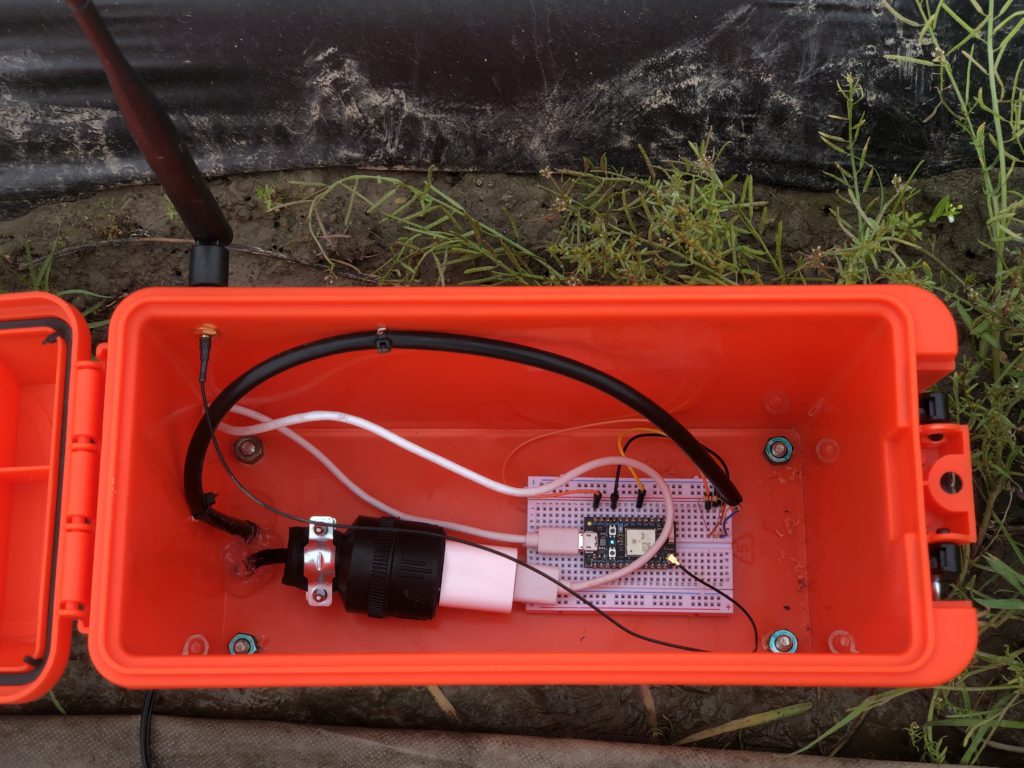
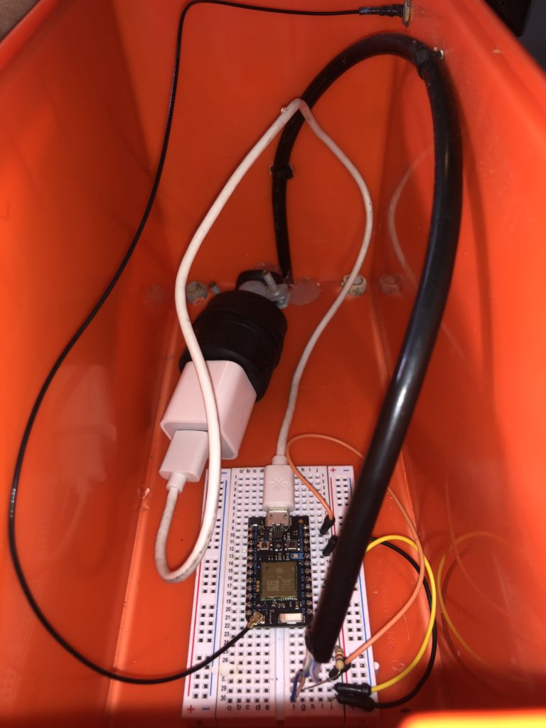
Enclosure
I used a plastic ammo case which worked well
Power supply
I used a USB charger block
Additional supplies to consider:
A weather-resistant way to connect the power supply:
I ran some lamp wire through a small hole in the bottom of the box, then added plugs to each end.
Extension to the temperature probe wire
I used Cat5 cable
Do you need to keep the box upright and out of mud/water?
I added some 4″ bolts as legs/stakes to secure the box upright and still ~2″ off the ground. This also allowed me to run the cables out of the bottom where they wouldn’t be subjected directly to rain
Silicone/caulk to seal holes
Setup
Particle has a great Quickstart guide for each model of board, so I won’t reinvent the wheel explaining it here.
Also spend some time on Particle’s Hardware Examples page to acclimate yourself with the setup() and loop() structure of the code, how to read and write GPIO pins, the use of delays, etc.
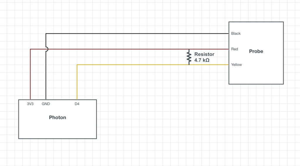
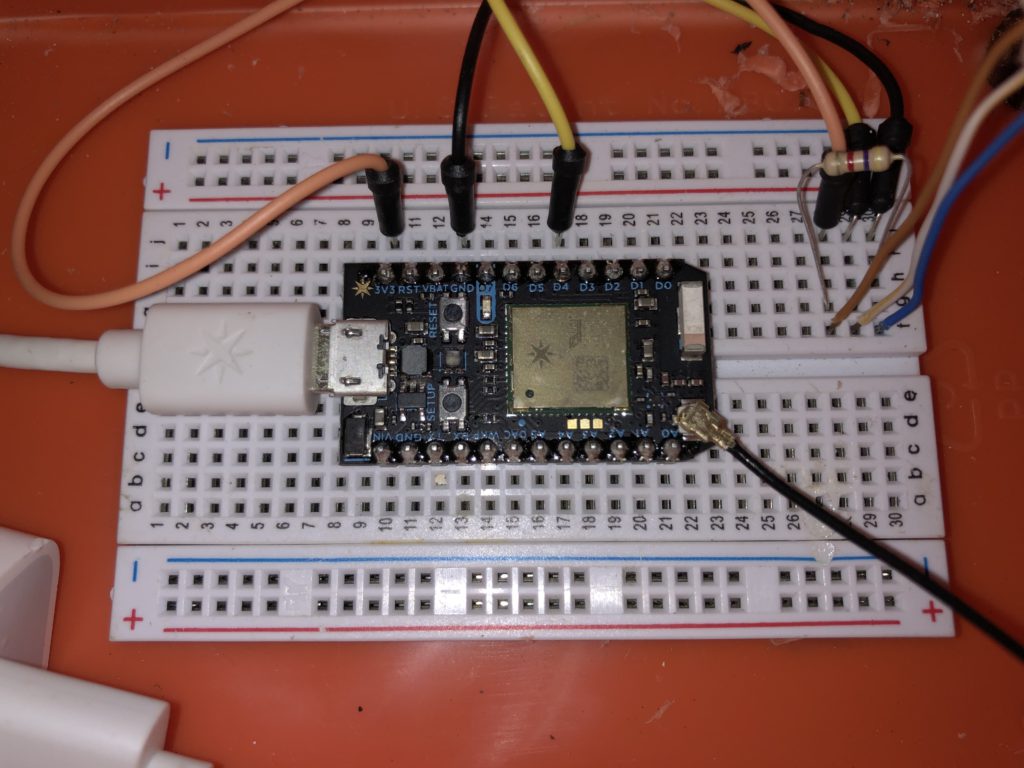
Hardware Configuration
SchematicBreadboard wiring with jumper cables to consolidate probe wiring in 3 adjacent pins. Note: the Cat5 wiring I used to extend the probe didn’t color-coordinate perfectly. I chose to map Brown=Red, White/Yellow=Yellow, Blue=Black. The black wire running out of the bottom right corner of the Particle board is the antenna.
As a practical matter, you’ll also want to consider how the probe wire is entering the box and how to provide strain relief to prevent it from (easily) pulling out of the breadboard. In my case, I made one large arc with the Cat5 cable which was anchored to the wall with several zip ties. I sealed these zip tie holes as well as the cable holes on the bottom with silicone.
Software Configuration
First, we’ll need to read the temperature from the probe and publish it to Particle’s cloud. Secondly, we’ll need to configure the Particle cloud to publish that data to a ThingSpeak dashboard for collection and graphing.
More buck-passing: I followed this tutorial from Particle, but I’ll list all my steps here as they diverge in the use of ThingSpeak.
Particle
The DS18B20 thermometer requires use of the 1-Wire protocol which is understood but the author in theory if not in practice. 1-Wire’s setup and error checking takes up the majority of the code.
// This #include statement was automatically added by the Particle IDE.
#include <OneWire.h>


OneWire ds = OneWire(D4);  // 1-wire signal on pin D4

unsigned long lastUpdate = 0;

float lastTemp;

void setup() {
  Serial.begin(9600);

  pinMode(D7, OUTPUT);
}


void loop(void) {
  byte i;
  byte present = 0;
  byte type_s;
  byte data[12];
  byte addr[8];
  float celsius, fahrenheit;

  if ( !ds.search(addr)) {
    Serial.println("No more addresses.");
    Serial.println();
    ds.reset_search();
    delay(250);
    return;
  }

  // The order is changed a bit in this example
  // first the returned address is printed

  Serial.print("ROM =");
  for( i = 0; i < 8; i++) {
    Serial.write(' ');
    Serial.print(addr[i], HEX);
  }

  // second the CRC is checked, on fail,
  // print error and just return to try again

  if (OneWire::crc8(addr, 7) != addr[7]) {
      Serial.println("CRC is not valid!");
      return;
  }
  Serial.println();

  // we have a good address at this point
  // what kind of chip do we have?
  // we will set a type_s value for known types or just return

  // the first ROM byte indicates which chip
  switch (addr[0]) {
    case 0x10:
      Serial.println("  Chip = DS1820/DS18S20");
      type_s = 1;
      break;
    case 0x28:
      Serial.println("  Chip = DS18B20");
      type_s = 0;
      break;
    case 0x22:
      Serial.println("  Chip = DS1822");
      type_s = 0;
      break;
    case 0x26:
      Serial.println("  Chip = DS2438");
      type_s = 2;
      break;
    default:
      Serial.println("Unknown device type.");
      return;
  }

  // this device has temp so let's read it

  ds.reset();               // first clear the 1-wire bus
  ds.select(addr);          // now select the device we just found
  // ds.write(0x44, 1);     // tell it to start a conversion, with parasite power on at the end
  ds.write(0x44, 0);        // or start conversion in powered mode (bus finishes low)

  // just wait a second while the conversion takes place
  // different chips have different conversion times, check the specs, 1 sec is worse case + 250ms
  // you could also communicate with other devices if you like but you would need
  // to already know their address to select them.

  delay(1000);     // maybe 750ms is enough, maybe not, wait 1 sec for conversion

  // we might do a ds.depower() (parasite) here, but the reset will take care of it.

  // first make sure current values are in the scratch pad

  present = ds.reset();
  ds.select(addr);
  ds.write(0xB8,0);         // Recall Memory 0
  ds.write(0x00,0);         // Recall Memory 0

  // now read the scratch pad

  present = ds.reset();
  ds.select(addr);
  ds.write(0xBE,0);         // Read Scratchpad
  if (type_s == 2) {
    ds.write(0x00,0);       // The DS2438 needs a page# to read
  }

  // transfer and print the values

  Serial.print("  Data = ");
  Serial.print(present, HEX);
  Serial.print(" ");
  for ( i = 0; i < 9; i++) {           // we need 9 bytes
    data[i] = ds.read();
    Serial.print(data[i], HEX);
    Serial.print(" ");
  }
  Serial.print(" CRC=");
  Serial.print(OneWire::crc8(data, 8), HEX);
  Serial.println();

  // Convert the data to actual temperature
  // because the result is a 16 bit signed integer, it should
  // be stored to an "int16_t" type, which is always 16 bits
  // even when compiled on a 32 bit processor.
  int16_t raw = (data[1] << 8) | data[0];
  if (type_s == 2) raw = (data[2] << 8) | data[1];
  byte cfg = (data[4] & 0x60);

  switch (type_s) {
    case 1:
      raw = raw << 3; // 9 bit resolution default
      if (data[7] == 0x10) {
        // "count remain" gives full 12 bit resolution
        raw = (raw & 0xFFF0) + 12 - data[6];
      }
      celsius = (float)raw * 0.0625;
      break;
    case 0:
      // at lower res, the low bits are undefined, so let's zero them
      if (cfg == 0x00) raw = raw & ~7;  // 9 bit resolution, 93.75 ms
      if (cfg == 0x20) raw = raw & ~3; // 10 bit res, 187.5 ms
      if (cfg == 0x40) raw = raw & ~1; // 11 bit res, 375 ms
      // default is 12 bit resolution, 750 ms conversion time
      celsius = (float)raw * 0.0625;
      break;

    case 2:
      data[1] = (data[1] >> 3) & 0x1f;
      if (data[2] > 127) {
        celsius = (float)data[2] - ((float)data[1] * .03125);
      }else{
        celsius = (float)data[2] + ((float)data[1] * .03125);
      }
  }

  // remove random errors
  if((((celsius <= 0 && celsius > -1) && lastTemp > 5)) || celsius > 125) {
      celsius = lastTemp;
  }

  fahrenheit = celsius * 1.8 + 32.0;
  lastTemp = celsius;
  Serial.print("  Temperature = ");
  Serial.print(celsius);
  Serial.print(" Celsius, ");
  Serial.print(fahrenheit);
  Serial.println(" Fahrenheit");

  // now that we have the readings, we can publish them to the cloud
  String temperature = String(fahrenheit); // store temp in "temperature" string
  digitalWrite(D7, HIGH);
  Particle.publish("temperature", temperature, PRIVATE); // publish to cloud
  delay(100);
  digitalWrite(D7, LOW);
  delay((60*1000)-100); // 60 second delay
}
Several things to note:
D4 is declared as the data pin in line 5.
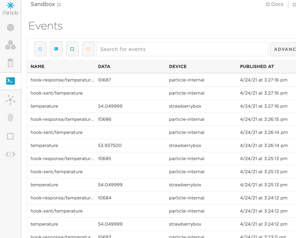
The first argument in Particle.publish() can be any string label you choose. This event name is what you’ll use in the Particle cloud to identify this piece of data.
D7 on the Photon I’m using is the onboard LED. I set it to blink for at least 100 milliseconds each time a temperature is published. This helps in debugging, as you can verify by watching the device if there is a temperature reading being taken.
I’m publishing a temperature every 60 seconds. The delay function takes in milliseconds, hence the 60 * 1000. To be petty, I subtract 100 milliseconds from the delay total to account for the 100 milliseconds of D7 illumination I added above.
Once you flash the above code to your Particle device, navigate to the Events tab in the Particle console. You should start seeing data published at whatever interval and name you configured.
Software- ThinkSpeak
Once the data is publishing to Particle’s cloud, you can go many places with it. I chose to use ThinkSpeak so I could easily view the current temperature from a browser and see a simple historical graph.
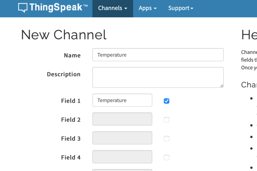
Create a new Channel and label Field 1 as temperature
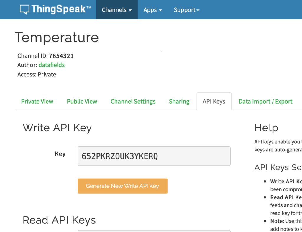
After creating the channel, click on API Keys. Make note of the Channel ID and Write API Key.
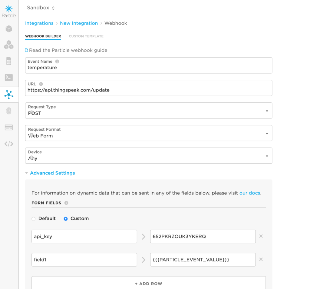
Back at the Particle Console, click on the Integrations tab.
Click New Integration, and select Webhook.
Webhook fields:
Event Name: the event name to trigger this web hook- whatever you set as the first argument in the Particle.publish() function
URL: https://api.thingspeak.com/update
Request Type: POST
Request Format: Web Form
Device: can be left to Any, unless you only want specific devices in your cloud to trigger this webhook
Click on Advanced settings, and under Form Fields, select Custom.
Add the following pairs:
api_key > your api key
field1 > {{{PARTICLE_EVENT_VALUE}}}
Completed webhook form
Save this and navigate back to ThingSpeak. You should start seeing data publishing to your channel.
ThingSpeak Data Display Options
A ThingSpeak channel can be populated with Visualizations and Widgets which can be added with the corresponding buttons at the top of the channel. A widget is a simple indicator of the last known data value, while visualizations allow for historical data, *ahem*, visualization. You can also create your own MatLab visualizations if you want to do more sophisticated analysis or charting.
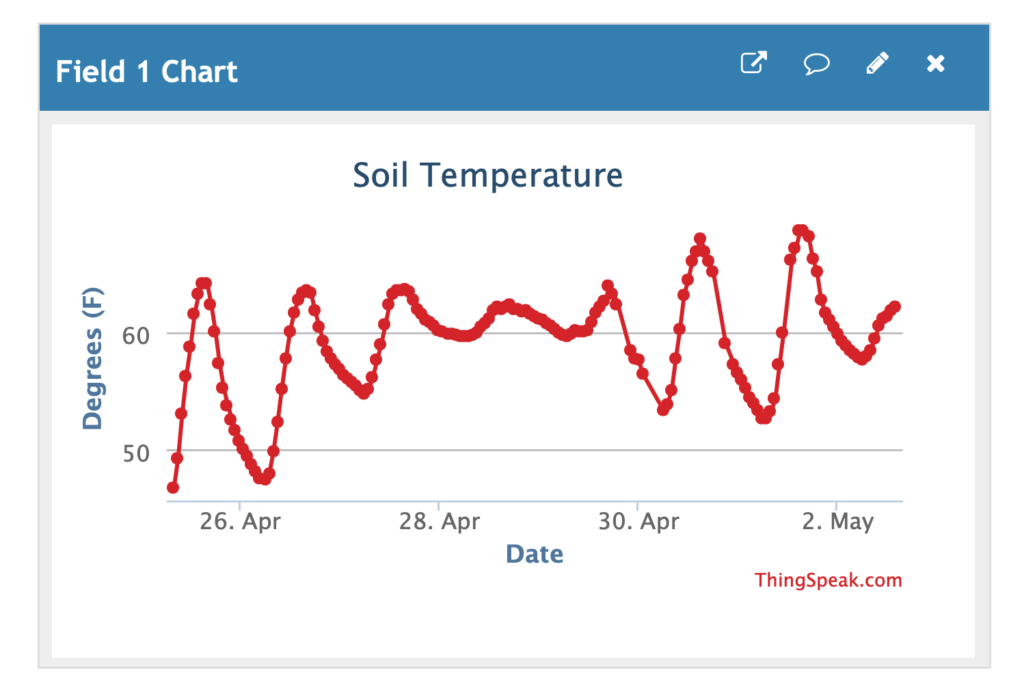
Chart Visualization
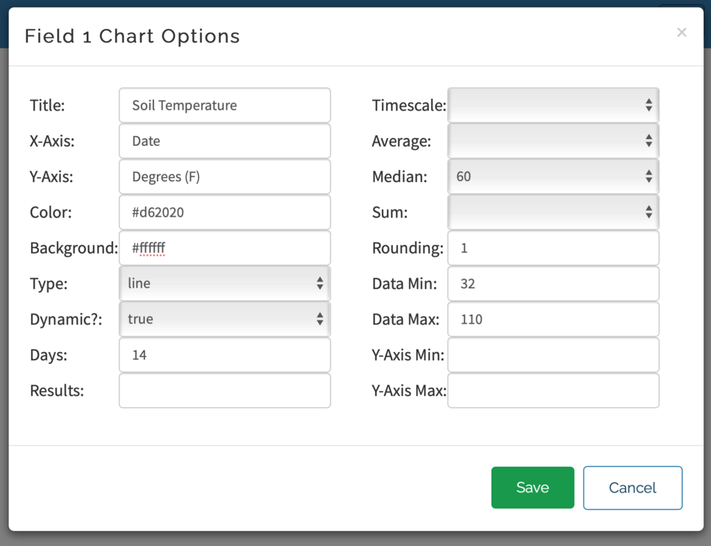
The Field 1 Chart should be added to channel automatically- if not, click Add Visualization and choose the Field 1 Chart. This visualization can be customized by clicking the pencil icon in the upper right corner and has a lot of configurable options:
Title: chart title that appears directly above graph (there’s no way to change the “Field 1 Chart” in the blue bar)
X-Axis: text label for x axis
Y-Axis: text label for y axis
Color: hex color code for chart line/points
Background: hex color code for chart background
Type: choice between:
Line (shown in my example)
Bar
Column
Spline
Step
Not sure what Spline and Step do as they look the same as the Line graph, so you’ll have to play around and see what you prefer
Dynamic: not sure what this does, I see no effect when toggling
Days: how many days of historical data to show (seems to be capped at 7 days regardless of larger values being entered)
Results: limit the chart to a certain number of data points. If you collect data once a minute, limiting to 60 results would give you one hour of data. Leave this field blank to not apply result limit.
Timescale / Average / Median / Sum:
These are mutually exclusive ways of aggregating the data together into fewer graph points. Timescale and Average seem to be the same, so effectively you’re choosing between the average, median, and sum of every X number of points. This simplifies the graph compared to showing 7 days worth of minutely data.
I like to use Median with 60 points to get a median hourly data. I chose median because occasionally for unknown reasons, the Particle will report of temperatures of several thousand degrees which is obviously an error. When using average I would see spikes on any hours with such an error, whereas median eliminates that pull.
Rounding: number of decimal places to display when clicking on a point
Data Min: The minimum value that should be included in the data set. Any data points lower than this won’t be attempted to be graphed. This also helps with the bizarre temperature error I mentioned above, so I often set this to temperature ranges safely at the far edges of what would be normal for my application
Data Max: Opposite of data min, sets an upper bound for included data
Y-Axis Min: Impacts the visual rendering of the y axis. Leave blank to automatically adjust the axis according to the data being graphed.
Y-Axis Max: Opposite of Y-Axis Min, sets upper bound for y-axis rendering
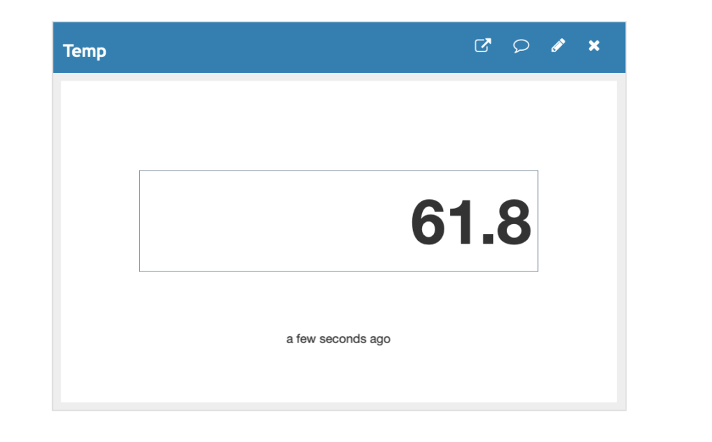
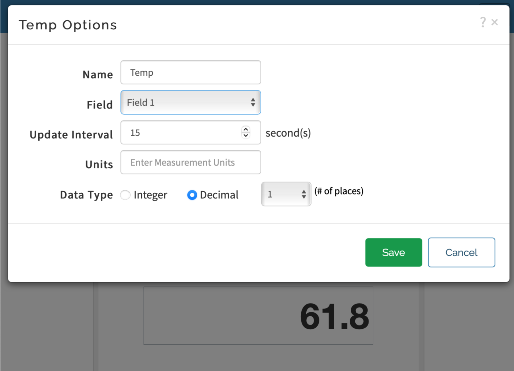
Numeric Display Widget
The numeric display will simply show the last recorded value as well as an indicator for how old that data is. I made this the first widget on the channel so I can see right away what the “current” value is.
This widget has several configurable options, like the name that will appear in the blue title bar, which field is being displayed, and how often the widget should refresh with new data. I set this to 15 seconds which is plenty often for data that should only change every 60 seconds. You can also round to a certain number of decimal places.
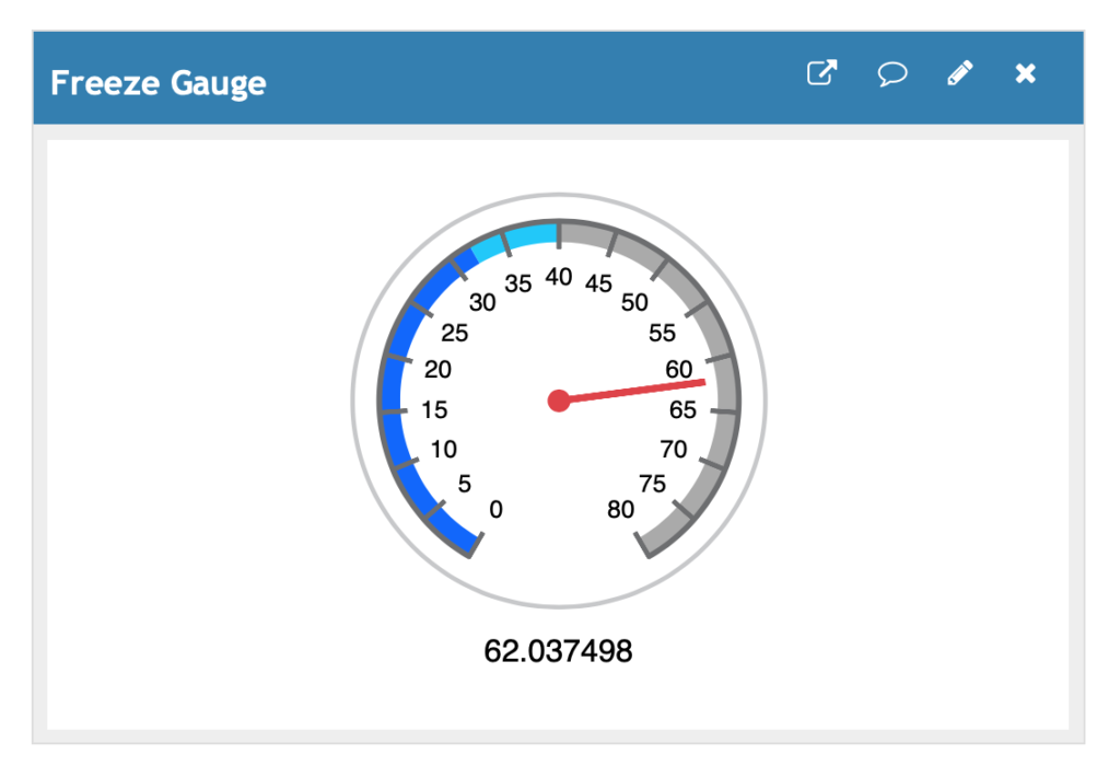
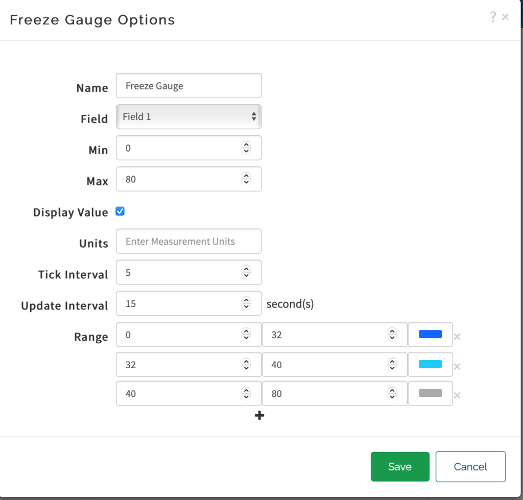
Gauge Widget
The gauge widget adds some visual context for the data and allows you to customize numerical ranges and colors associated with ranges. Here’s an example of a gauge with color ranges for freezing or near freezing temperatures.
Configurable options for this include the widget title, minimum and maximum gauge range, and start/stop values for color bands.
Lamp Widget
This is the most limited display type, but I guess its cute. It allows you to turn on or off a virtual light bulb above/below a given threshold. The logic is very similar to the gauge but simpler, so I won’t spend time re-explaining the functionality.
Adding Additional Sensors
Every step in this data pipeline (the Particle hardware, the Particle Cloud, and ThingSpeak’s channels) are ready to accept multiple pieces of data if you want to add more sensors to the box.
It’s easy to imagine some of the additional data that could be added to the board and collected.
In the future, I’d like to buy a Boron board with cellular connectivity and make a standalone box with a solar panel and battery that could be flexibly placed anywhere. I’m also interested in the idea of wiring up the board to a handful of plugs through the side of the box and being able to easily add and remove sensors based on the need of the use. I’ll keep you posted if I do this.
If you have any use case ideas or want to share your own project or implementation, please leave a comment or get in touch!
Early in 2020, I was facing my first year of managing my own acreage and subsequently marketing the grain (what a roller coaster I was in for) so I became a sponge for any advice I could find. I spent some time reading through Nick Horob’s thoughts on the Harvest Profit blog and I joined the Grain Market Discussion Facebook group. One theme I repeatedly encountered was the importance of separating the futures and the basis portion of a sale. This was enabled by “understanding your local historical basis patterns”. I had no clue what was typical in our area, so I jumped on the challenge of obtaining a data set to assist in this.
Over a year later this is still a work in progress, but I’ll report what I’ve learned thus far in my quest to quantify the local basis market.
Free Data Sources
USDA Data
The USDA’s Ag Marketing Service has basis data available via this query tool for the following locations:
Augusta, AR
Blytheville, AR
DeWitt, AR
Dermott, AR
Des Arc, AR
Helena, AR
Jonesboro, AR
Little Rock, AR
Old Town/Elaine, AR
Osceola, AR
Pendleton, AR
Pine Bluff, AR
Stuttgart, AR
West Memphis, AR
Wheatley, AR
Wynne, AR
East Iowa, IA
Iowa, IA
Mississippi River Northern Iowa, IA
Mississippi River Southern Iowa, IA
Mississippi River Southern Minn., IA
North East Iowa, IA
North West Iowa, IA
Southern Minnesota, IA
West Iowa, IA
Central Illinois, IL
Illinois River North of Peoria, IL
Illinois River South of Peoria, IL
Central Kansas, KS
Western Kansas, KS
Louisiana Gulf, LA
Duluth, MN
Minneapolis, MN
Minneapolis – Duluth, MN
Minnesota, MN
Kansas City, MO
Nebraska, NE
Portland, OR
Memphis, TN
Technically, this data does allow for future basis as the Delivery Period column contains a few rows for “New Crop”, but most of the data I’ve seen from this is “Cash” (spot price), so it won’t provide a sense of how the basis changes as the delivery period approaches. The geographic coverage is also hit or miss- congrats to everyone who lives in Arkansas; those of us in the large and ambiguous area of “Central Illinois” envy your data granularity.
Bottom line: if you farm near an unambiguous location and just need a continuous chart, this would be a good data source for you.
University of Illinois Regional Data
One of the first resources I came across were these regional datasets (corn, soybeans) from the University of Illinois which go back to the 1970s. This is tracked across 7 regions in Illinois and does a slightly better job of getting closer to your local market:
Northern
Western
N. Central
S. Central
Wabash
W.S. West
L. Egypt
Unlike the continuous spot data from the USDA, this data tracks 3 futures delivery periods (December, March, July) starting in January of the production year. This provides as much as ~80 weeks of July basis futures, for example.
This regional data is likely to be more smoothed out than what you’d see at any specific elevator, so it’s challenging to make very qualitative decisions with it directly. I’ve attempted to calibrate this data to my local market using regression analysis and haven’t been that comforted with the accuracy of the results. I’d only recommend this dataset as a way of generalizing the shape of the seasonal trend without looking at the actual numeric levels.
Bottom line: this data shows how basis changes as delivery approaches in several contract months, but is limited to Illinois and the regional average isn’t likely precise to your local elevators.
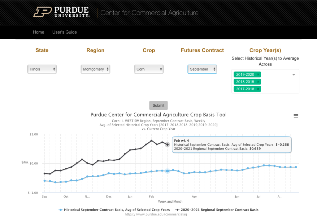
Purdue University Crop Basis Tool
For those looking for similar regional data not limited to Illinois, this web-based dashboard from Purdue University offers similar data for Indiana, Ohio, Michigan, and Illinois. This is also very user friendly and allows you to dig into the data from a web browser without the need for opening a spreadsheet.
I did a bit of spot checking and found the values for my county to be way off, so I think that falls into the same issues as the U of I data in terms of regional smoothing and an offset. It’s also easy to have a false expectation of precision given that you select your county but it just does a lookup for the appropriate region.
Bottom line: this is most user-friendly free tool I’ve found for viewing basis data and comparing to historical averages, but is limited to 4 states and is still regionally averaged so won’t match values at your local elevators.
DIY Data Collection
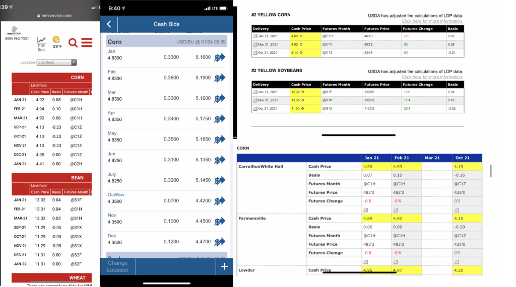
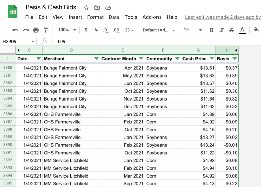
What’s the surefire way to get 5 years of data on anything? Start collecting it today, and you’ll have it in 5 years. This is the slow-go approach but one I’ve seen repeated by other farmers who track basis- I’ve asked around thinking somebody has some great off the shelf dataset, and often you’ll find people just check prices weekly and dump it in a spreadsheet.
My process is to take phone screenshots of cash bids twice a week (I chose Monday and Thursday). This is a very fast and easy way of capturing the data that I can keep up with even in the busy season. I then go through these screenshots when I have time each week or so and type the data into a spreadsheet. This only takes me about 10 minutes a week to populate since the contract months and locations don’t change that frequently and can be copied and pasted from the previous entry.
Another route you could go (depending on your elevators’ participation) is to sign up for email cash bids. In my case, not everywhere I wanted to track offered this, so if I was going to screenshot one, I might as well do that for my whole process. (If you go that route, you may want to set up a different email inbox and a forwarding rule to save yourself the spamming.)
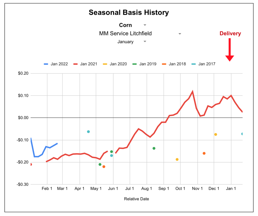
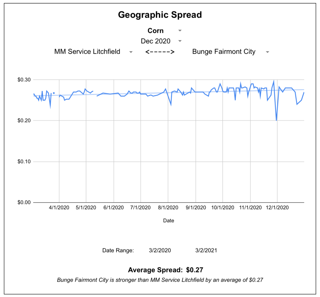
Based on this normalized data, I set up a few pages with pivot tables and charts. My primary goal is to understand when to make cash sales vs HTAs, and when to then set the basis on those HTA; that’s what I hope to visualize with this main chart below.
You’ll also notice a few points from past years- I dug out old cash sale records for our farm and backed into the basis by looking up the board price for that day on these historical futures charts. It wasn’t documented what time of day the sale was made so there could be some slippage, but I excluded any days where there was a lot of market volatility figuring that it would be better to have less data than wrong data.
I also created this page to chart basis spreads between any two locations, in this case frequently viewed between a local elevator and a river terminal.
The great thing about having your own data is the flexibility to query it however you want. I’m sure as needs change I’ll make different types of reports and queries that answer questions I have yet to ask.
Here’s a link to a blank copy of my Google Sheet for you to use and branch off of as you wish. Things might look funky at first without data, but once you populate the Raw Data sheet a bit all the queries and dropdown should work.
Bottom line: You won’t see quick results, but collecting your own basis data is free, not that hard to do, and ensures the data is precise to your area. It’s also the ultimate insurance policy against changes in the availability of an outside data set.
Paid Data Sources
GeoGrain- Dashboard Subscription
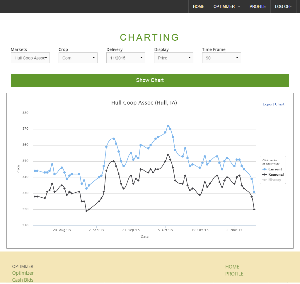
GeoGrain is a paid subscription dashboard that tracks cash bids and basis levels at an elevator-specific level. I found most of the elevators in my area listed there and had decent luck viewing historical data.
One of GeoGrain’s strength is the Optimizer, a tool within the app where you can plug in various trucking expenses and get real-time recommendations on where to most effectively deliver grain. You can also compare an elevator’s basis to the regional average.
This would be great for someone who wants to shop around for the best basis with every sale they make or truckload they spot sell. In my case, I’m more curious about setting basis for HTAs contracts I have at a few elevators I regularly work with. You can also view current basis relative to a simple average of the last X years which can be configured in your account settings, as well as a regional average of X miles away, also configurable in your account settings. I would personally like to see a bit more granularity and customization in the historical comparison where you could pick what specific years you want to compare to that might match a common theme (export-driven bull market year, drought year, planting scare year, etc), or do some technical analysis on the basis chart.
GeoGrain does offer a 14 day free trial, so definitely check it out and see if it will work for you.
Bottom line: for $50/month, GeoGrain gives you elevator-specific basis levels (current and historical) in a web dashboard. The reports are geared toward the seller who shops around, but may not provide enough in-depth querying for a specific merchant.
GeoGrain- Historical Data Purchase
In addition to their dashboard service, GeoGrain also sells historical datasets for use in your own analysis tools. The first ~300,000 days of data is a flat $500, then there’s a variable fee for data sets larger than that.
This is daily data and includes the basis and cash price (although I was told it only included basis when I purchased, so perhaps cash price is not guaranteed for all locations). So figuring 252 trading days in a year, 6 delivery periods bid at a time (let’s say), and 2 commodities, an elevator would produce about 3,000 data points per year. I doubt they have 100 years of data on any elevator, so to make the best use of your $500 you’ll want to select several locations and can certainly gain a lot of geographic insight from doing so.
I did end up buying historical data this way and imported it into my DIY data entry spreadsheet to make my historical comparisons come alive. I haven’t yet found a preferred technical analysis method for making quantitative decisions against this data, but that’s my next step.
Bottom line: if you want to analyze basis in your own tool and it’s not worth waiting to acquire it yourself, this is a straightforward process for buying historical data.
DTN ProphetX
ProphetX is primarily a trading and charting suite but they have been advertising an upcoming feature for basis charts and county averages. This is a part of ProphetX Platinum, which runs $420 / month according to a sales representative I spoke with. This doesn’t pencil out well for my intended use especially compared to a one-time purchase above, so I didn’t pursue it much further.
What works for you?
If there’s anything you should take from this, it’s that I’m still learning and always on the lookout for a better option. If you have a different insight about anything in this article, I’d genuinely like to learn about it and incorporate it in my practices. Leave a comment below or get in touch with me.
In early 2019, I made the pivot from my job in the tech industry and returned to the family grain farm full time. Sure, I had helped out on weekends and during harvest for years and had a rough idea of what went on, but the details of day to day operations were new to me and I worked like a sponge to absorb it all. I though I was doing pretty well until about a year later when annual jobs started to repeat, and I realized I had not retained as much as I’d thought. I began to appreciate the expanse of my dad’s knowledge and his memory about everything on the farm, what size of wrench was needed for this, the quirks of operating this particular piece of equipment, etc. He was around to tell me about it now, but what if something happened to him suddenly? How could I capture his expertise for the long term, or even just for next season when the details are fuzzy?
Around this time I was also reading The E-Myth. The book lays out the case that your role as a small business owner isn’t to work in the business, but work on the business. One of the key ways this is done is through the development of documentation and procedural checklists to get the information out of the business owner’s head and into a repeatable, scalable business management process for delegation to others.
At this point a light bulb went off: I could document the operational details of the farm for my own reference, and in doing so, build up an asset that would allow the business to be more scalable and predictable in the future.
Obviously the necessity of these practices will vary by operation, but I’d make the case that almost any farm could benefit from a bit more documentation. How often do you end a season with a great tip for how to operate a piece of equipment, and by the next year you’re back to doing it by gut and have forgotten some of the quirks? How much time do you spend onboarding new help? What if you had a medical emergency in the middle of a busy season, would you have anything documented outside of your brain for someone to pick up?
Picking the right solution
There are many routes you could go in documenting your operations. Out of the gate I assumed the documentation system would need to be easily editable (a physical book or PDF seemed far too static) and usable on a variety of devices. I originally considered using Google Docs, but I was concerned I’d end up with handful of huge documents that would take a lot of scrolling, with less ease for linking between a mesh of smaller pages. I also wanted to be able to send anyone a link and login credentials without the need for an app installation. A Wiki server seemed like a great solution based on these constraints, and I haven’t seriously pursued other alternatives since going down this Wiki path.
MediaWiki is the free, open-source technology at the heart of Wikipedia. It is a web-based platform that allows for rapid creation of pages and editing at any time. There are several routes to go in setting up your own wiki server.
Setting up the Wiki server
Managed hosting (easiest)
There are a handful of companies that offer managed wiki hosting where you can provision and configure the entire server within a web browser. Here’s a directory from MediaWiki that lists some companies offering hosting.
One platform I tried is WikiDot which offers a free plan for up to 5 users and 300 MB of site space. I’d recommend an approach like this to see if you even want to go the wiki route in E-Mything your farm. If you like the wiki platform and see a future in it, you could do some more through shopping around for an ideal long-term host. In some cases you can download your data from one and import it into another.
DIY hosting (advanced)
After giving WikiDot a try and feeling disappointed with the relatively clunky themes and lack of deeper control, I decided to just set up my own using Amazon Web Services. If this is something you’re familiar with, you don’t need me to tell you how to do it, and frankly I don’t remember what guides I followed that I would link to anyway. I did start out with a blank Amazon Linux 2 instance and installed a LAMP stack and MediaWiki on it manually because I’m stubborn and old fashioned. Looking back I should have investigated using a marketplace image with MediaWiki installed fresh out of the gate as it would save time and setup fragility. That could be a good route to explore.
Structuring your content
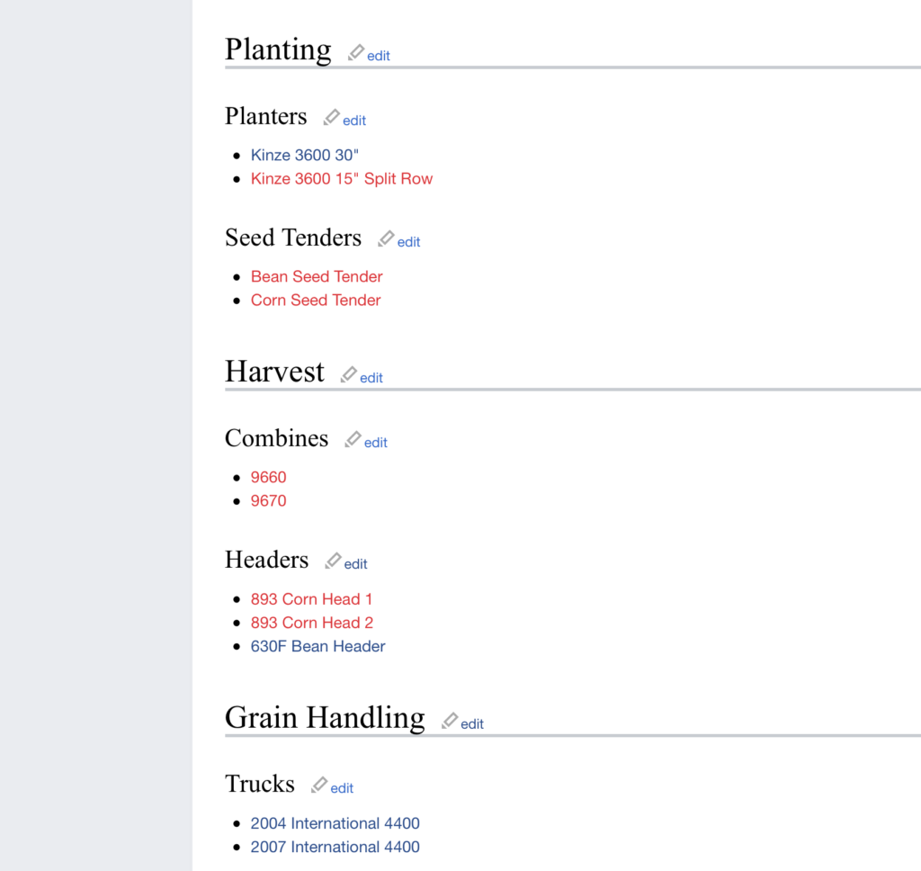
A Wiki server is just a bunch of pages that can link to each other, so take the pressure off that this has to be perfectly organized out of the gate. Just start getting some ideas down and flesh out a structure as you go. I chose to take a hierarchical approach, setting up general pages (like Facilities) that serve as directories to more and more specific content. Again, all of the pages are peers to one another in a technical sense and should have links to each other as appropriate, but this helps with navigation. This also gives you some flexibility to document information about an entire farm (like its address) or a specific building (like the bushel capacity of a bin).
Facilities
Home
Shop
Locations of types of tools
Quirks of opening west door
Old Morton Building
Door height
Rafter height
West Farm
Bin 1
Diameter & Capacity
Under-bin augerdimensions
Which handle is for which sump?
Bin 2
Bin 3
Page Links
Part of the genius of Mediawiki that allows for such rapid expansion of content is the way you create a page. The recommended practice is to create a link first (to a page that does not exist), then follow that link which will open in a page editor. Page links are created by putting the page name in double brackets.
[[Equipment]]
So you can create a page called Equipment, then click on it to edit that page. Then you can immediately list all your equipment as page links and save the page.
This page is now not only a list of your equipment, but a springboard to create all of those individual pages whenever you’re ready to document something about them. This allows you to very rapidly flesh out basic pages and structure.
Headings
Organizing your page content with headers and subheadings can be very helpful for navigation and is pretty easy to do by surrounding the title in a varying number of equal signs. This will also automatically create a table of contents at the top of the page.
Append each line with an asterisk * to create a bulleted list, or a # to create a numbered list (it will automatically handle the number incrementation much like a numbered list in a word processor). This applied some indenting and padding to make the list easier to read.
* Bullet list item
* Bullet list item 2

# Number 1 item
# Number 2 item
Example
Putting these concepts together, here’s a snippet of text from my equipment page, along with the formatted page below. For the theme I’m using, I prefer to skip the Heading 2 tag and jump straight to 3. Play around and see what you like.
Links that reference a page that do not yet exist are highlighted in red.
Images
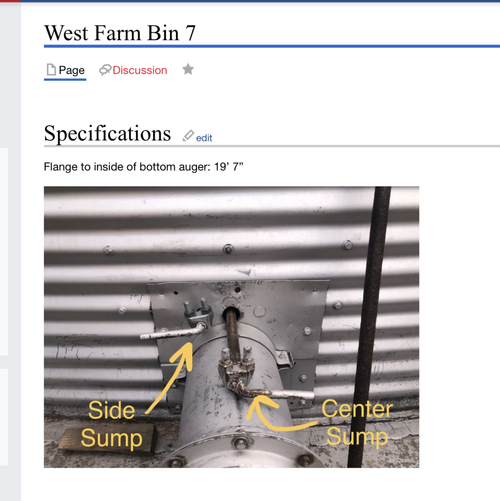
Inserting images into a page works just like creating a page- you’ll create a link to an image file that doesn’t yet exist, then upload an image onto that location.
[[File: westfarmbin7sumphandles.jpg]]
These file names are universal across the entire wiki site, so you’ll want your names to be descriptive to avoid duplicates down the road (i.e. sumphandles.jpg might work for the first bin you document, but for a different photo for the next bin you’ll have to call it sumphandles2.jpg (or something) so you might as well start with a unique and descriptive file name.
By default, an image inserted as above will display inline at its full size. For tips on formatting, refer to MediaWiki’s image help page.
Often I’ll annotate a photo in Markup before uploading it, which is often a much better visual explanation than doing it beside the photo through wiki text alone.
Avoid reinventing the wheel
You might be saying to yourself “why would I go through the hassle of documenting the location of a fuel filter on this tractor, John Deere has already done that in a service manual”. You shouldn’t! Your pages can (and should) link to outside webpages whenever possible. You could also even state common page numbers for things you want to reference in a paper manual, or a YouTube video of someone walking through it. That’s a great way to think. But you could still make a page for your tractor, list a bunch of links to helpful resources that are true for that model, and still have a section below to document quirks and history specific to this tractor. The goal is for this to be a single source of truth and an easy to access springboard to the information you (or anyone else on the farm) may need.
This also doesn’t need to be populated overnight. I imagine this will be a gradual, multi-year process for me as I try to remember to take photos and think through how we do all the things we do on the farm. Once the structure is in place though, I at least have a place to go with information I want to capture. If I have the patience to adopt a mentality of documentation every time I’m loading a grain truck, laying out a field, or doing service on a piece of equipment, someday I’ll have built up a great catalog of knowledge that can be passed to anyone regardless of whether I’m in an office or in a coma.
*Bonus daydream*
(This is not something I have immediate plans for, but a fun idea to consider down the road)
Once I have pages set up for all of the physical infrastructure of the farm, I could make weather-resistant QR code stickers and literally stick them wherever appropriate. Walk up to a grain bin, scan the QR code, boom, a wiki page for everything you might want to know about that grain bin. This shouldn’t be terribly hard to do at scale- this is the same idea as asset tags I’ve seen for library books or corporate computers, so presumably software exists for generating a code + some identifying text underneath based on a list of id strings or URLs and making labels. If not, it could certainly be hacked into existence through some combination of scripting and mail merge programs. If I do this someday, you’ll probably hear about it here.