

One of the first resources I found in my quest to quantify the local basis market was this dataset from the University of Illinois. It provides historical basis and cash price data for 3 futures months in 7 regions of Illinois going back to the 1970s.
On its own, I haven’t found any region in this dataset to be that accurate for my location. Perhaps I’m on the edge of two or three regions, I thought. This got me thinking- what if I had the actual weekly basis for my local market for just a year or two and combined that with the U of I regional levels reported for the same weeks? Could I use that period of concurrent data to calibrate a regression model to reasonably approximate many more years of historical basis for free?
I ended up buying historical data for my area before I could full test and answer this. While I won’t save myself any money on a basis data purchase, I can at least test the theory to see if it would have worked and give others an idea for the feasibility of doing this in their own local markets.
Regression Analysis
If you’re unfamiliar with regression analysis, essentially you provide the algorithm a series of input variables (basis levels for the 7 regions of Illinois) and a single output to find the best fit to (the basis level of your area) and it will compute a formula for how a+b+c+d+e+f+g (plus or minus a fixed offset) approximates y. Then you can run that formula against the historical data to estimate what those basis levels would have been.
We can do this using Frontline Solver’s popular XLMiner Analysis Toolpak for Excel and Google Sheets. Here‘s a helpful YouTube tutorial for using the XLMiner Toolpak in Google Sheets and understanding regression theory, and here’s a similar video for Excel.
Input Data Formatting
You’ll want to reformat the data with each region’s basis level for a given contract in separate columns (Columns E-K below), then a column for your locally observed values on/near those same dates (Column N). To keep things simple starting out, I decided to make one model that includes December, March, and July rather than treat each contract month as distinct models. To account for local-to-regional changes that could occur through a marketing year, I generated Column L to account for this, and since anything fed into this analysis needs to be numerical, I called it “Delivery Months after Sept” where December is 3, March is 6, and July is 10. I also created a “Days Until Delivery” field (Column M) that could help it spot relationship changes that may occur as delivery approaches.
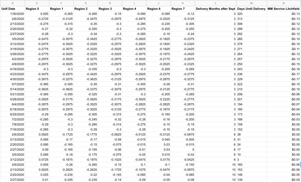
Always keep in mind: what matters in this model isn’t what happens to the actual basis, but the difference between the local basis and what is reported in the regional data.
⚠️ One quirk with the Google Sheet version- after setting your input and output cells and clicking the OK button, nothing will happen. There’s no indication that the analysis is running, and you won’t even see a CPU increase on your computer as this runs in Google’s cloud. So be patient, but keep in mind there is a hidden 6 minute timeout for queries (this not shown anywhere in the UI, I had to look in the developer console to see the API call timing). If your queries are routinely taking several minutes, set a timer when you click OK and know that if your output doesn’t appear within 6 minutes you’ll need to reduce the input data or use Excel. In my case, I switched to Excel part way through the project because I was hitting this limit and the 6 minute feedback loop was too slow to play around effectively. Even on large datasets (plus running in a Windows virtual machine) I found Excel’s regression output to be nearly instantaneous, so there’s something bizarrely slow about however Google is executing this.
Results & Model Refinement
For my input I used corn basis data for 2018, 2019, and 2020 (where the year is the growing season) which provided 9 contract months and 198 observations of overlapping data between the U of I data and my actual basis records. Some of this data was collected on my own and some was a part of my GeoGrain data purchase.
Here’s the regression output for the complete dataset:
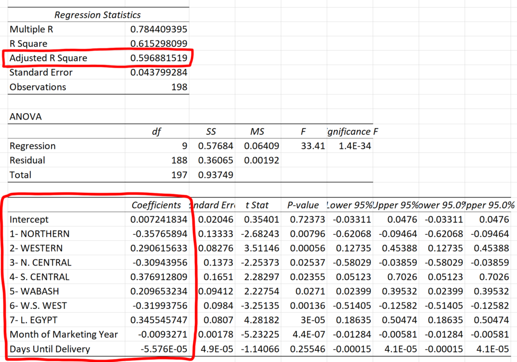
The data we care most about is the intercept (the fixed offset) and the coefficients (the values we multiply the input columns by). Also note the Adjusted R Squared value in the box above- this is a metric for measuring the accuracy of the model- and the “adjustment” applies a penalty for additional input variables since even random data can appear spuriously correlated by chance. Therefore, we can play with adding and removing inputs in an attempt to maximize the Adjusted R Squared.
0.597 is not great- that means this model can only explain about 60% of the movement seen in actual basis data by using the provided inputs. I played around with adding and removing different columns from the input:
| Data | Observations | Adjusted R Squared |
| All Regions | 198 | 0.541 |
| All Regions + Month of Marketing Year | 198 | 0.596 |
| All Regions + Days to Delivery | 198 | 0.541 |
| All Regions + Month of Mkt Year + Days to Delivery | 198 | 0.597 |
| Regions 2, 6, 7, + Month of Mkt Year + Days to Delivery | 198 | 0.537 |
| Regions 1, 3, 4, + Month of Mkt Year + Days to Delivery | 198 | 0.488 |
| All Data except Region 3 | 198 | 0.588 |
| December Only | 95 | 0.540 |
| March Only | 62 | 0.900 |
| July Only | 41 | 0.935 |
| December Only- limited to 41 rows | 41 | 0.816 |
Looking at this, you’d assume everything is crap except the month-specific runs for March and July. However, it seems like a good part of those gains can be attributable to the sample size though as shown in the December run limited to the last 41 rows, a comparable comparison to the July data.
Graphing Historical Accuracy
While the error metrics output by this analysis are quantitative and helpful for official calculations, my human brain finds it helpful to see a graphical comparison of the regression model vs the real historical data.
I created a spreadsheet to query the U of I data alongside my actual basis history to graph a comparison for a given contract month and a given regression model to visualize the accuracy. I’m using the “All Regions + Month of Marketing Year” model values from above as it had effectively the highest Adjusted R Square given the full set of observations.
In case it’s not obvious how you would use the regression output together with the U of I data to calculate an expected value, here’s a pseudo-formula:
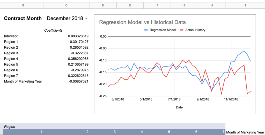
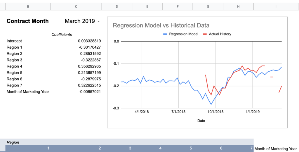
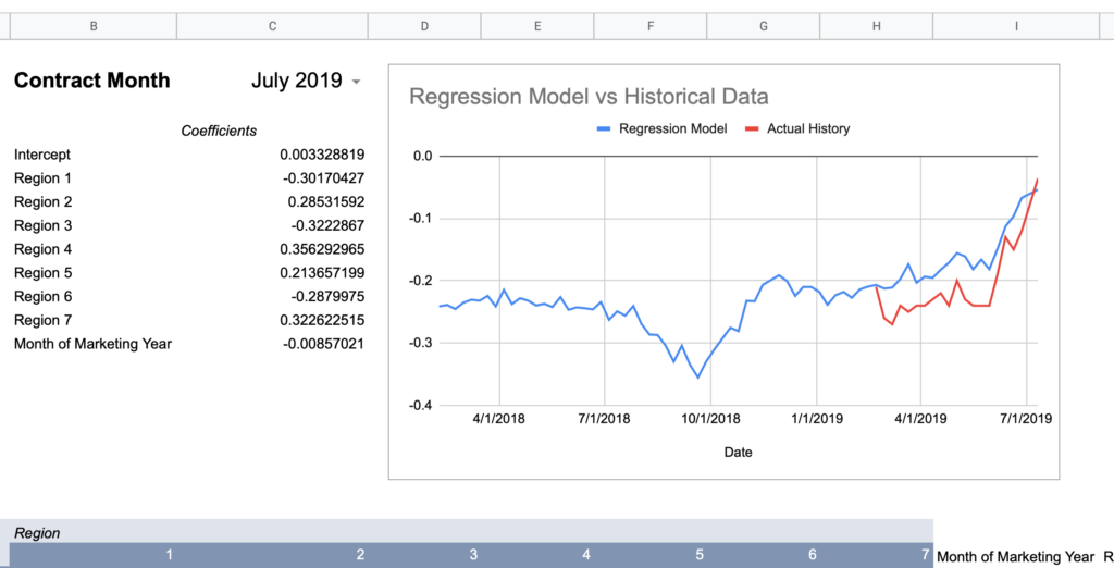
= intercept + (region1UofIValue * region1RegressionCoefficient) + (region2UofIValue * region2RegressionCoefficient) + ... + (monthOfMktYear * monthOfMktYearRegressionCoefficient)Now here are graphs for 2017-2019 contracts using that model:
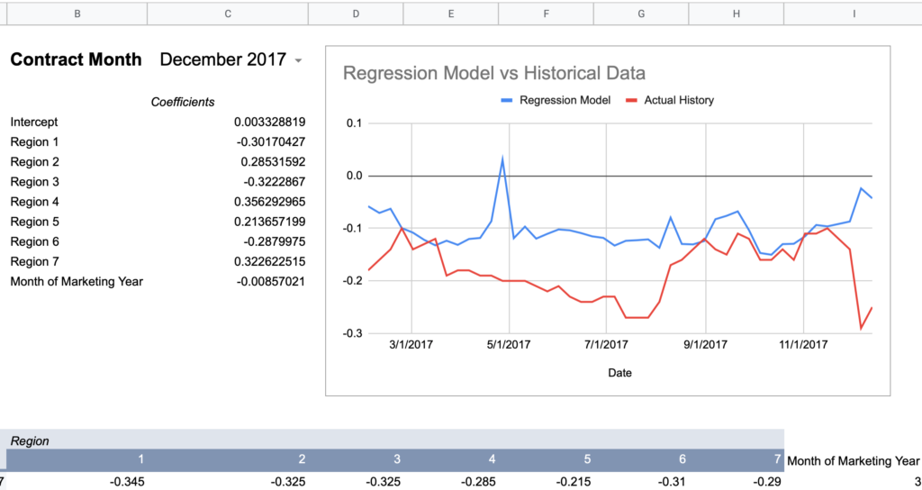
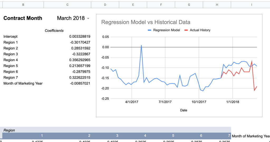
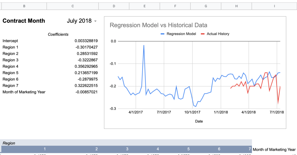
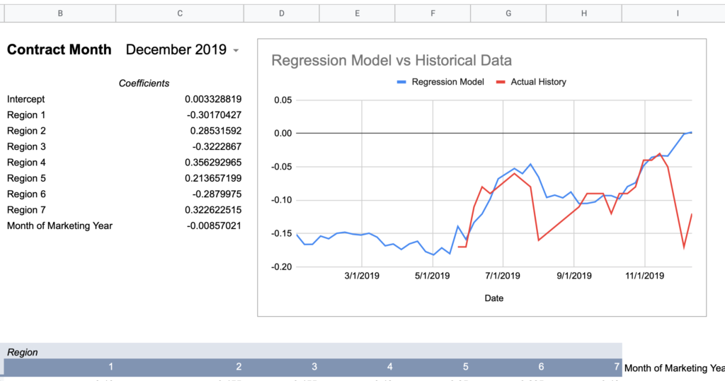
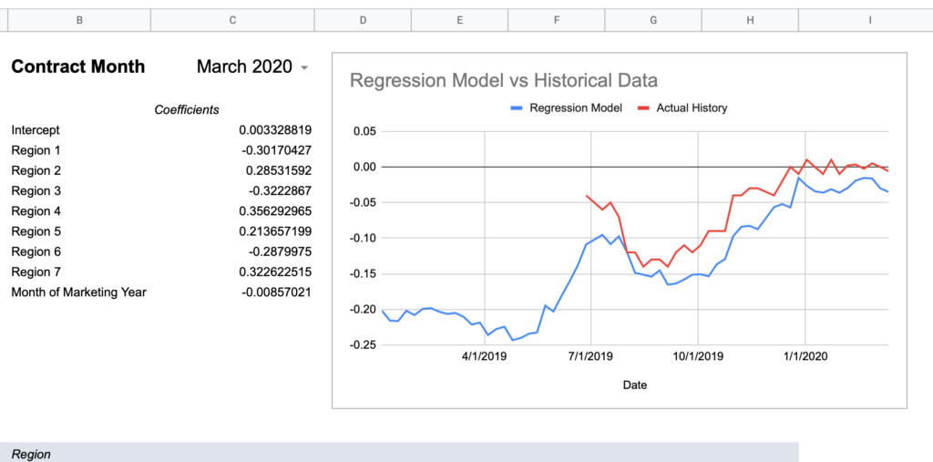
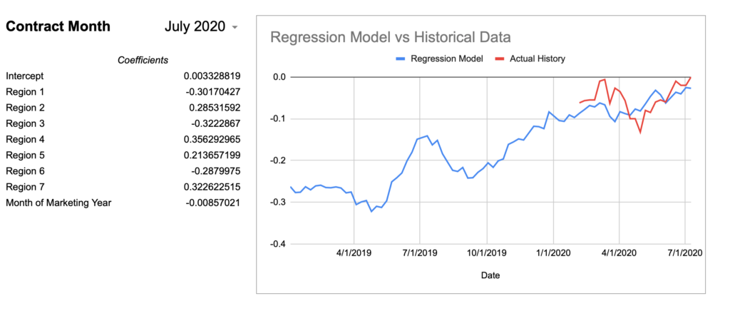
Here’s how I would describe this model so far:
Keep in mind, the whole point of a regression model is to train it on a subset of data, then run that model on data it has never seen before and expect reasonable results. Given that this model was created using 2018-2020 data, 2017’s large errors seem concerning and could indicate futility in creating a timeless regression model with just a few years of data.
To take a stab at quantifying this performance, I’ll add a column to calculate the difference between the model and the actual value each week, then take the simple average of those differences across the contract. This is a very crude measure and probably not statistically rigorous, but it could provide a clue that this model won’t work well on historical data.
| Contract Month | Average Difference |
| July 2021 | <insufficient data> |
| March 2021 | <insufficient data> |
| December 2020 | 0.05 |
| July 2020 | 0.03 |
| March 2020 | 0.04 |
| December 2019 | 0.03 |
| July 2019 | 0.05 |
| March 2019 | 0.03 |
| December 2018 | 0.04 |
| – – – – – – – | – – – – – – – – – – |
| July 2018 | 0.04 |
| March 2018 | 0.05 |
| December 2017 | 0.08 |
| July 2017 | 0.15 |
| March 2017 | 0.06 |
| December 2016 | 0.08 |
| July 2016 | 0.10 |
| March 2016 | 0.06 |
| December 2015 | 0.07 |
| July 2015 | 0.07 |
| March 2015 | 0.04 |
| December 2014 | 0.07 |
The dotted line represents the end of the data used to train the model. If we take a simple average of the six contracts above the line, it is 4.3 cents. The six contracts below the line average 7.6 cents.
Is this a definitive or statistically formal conclusion? No. But does it bring you comfort if you wanted to trust the historical estimation without having the actual data to spot check against? No again.
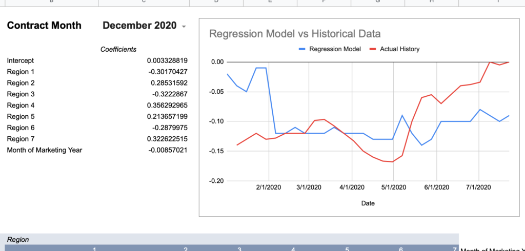
To provide a visual example, here’s December of 2016 which is mathematically only off by an average of $0.08.
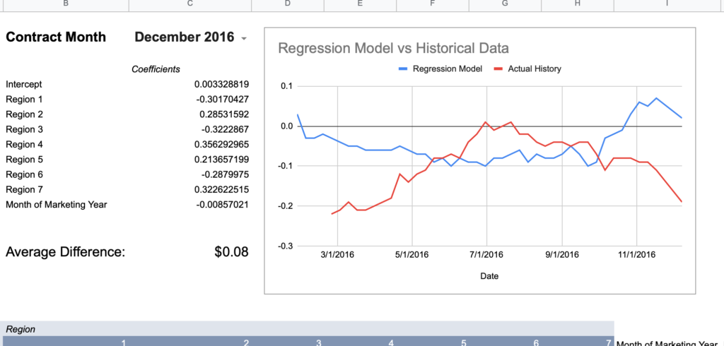
How much more wrong could this seasonal shape be?
Conclusion: creating a single model with 2-3 years of data does not consistently approximate history.
Month-Specific Model
Remember the month-specific models with Adjusted R Squares in the 80s and 90s? Let’s see if the month-specific models do better on like historical months.
| Contract Month | Average Difference (Old Model) | Average Difference (Month-Model) |
| July 2021 | <insufficient data> | |
| March 2021 | <insufficient data> | |
| December 2020 | 0.05 | 0.03 |
| July 2020 | 0.03 | 0.02 |
| March 2020 | 0.04 | 0.01 |
| December 2019 | 0.03 | 0.03 |
| July 2019 | 0.05 | 0.02 |
| March 2019 | 0.03 | 0.02 |
| December 2018 | 0.04 | 0.03 |
| – – – – – – – | – – – – – – – – – – | – – – – – – – |
| July 2018 | 0.04 | 0.04 |
| March 2018 | 0.05 | 0.03 |
| December 2017 | 0.08 | 0.05 |
| July 2017 | 0.15 | 0.11 |
| March 2017 | 0.06 | 0.06 |
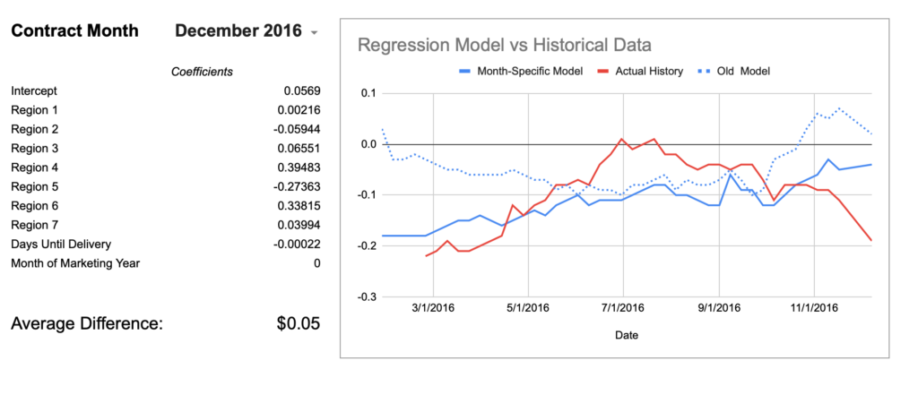
| December 2016 | 0.08 | 0.05 |
| July 2016 | 0.10 | 0.08 |
| March 2016 | 0.06 | 0.08 |
| December 2015 | 0.07 | 0.04 |
| July 2015 | 0.07 | 0.04 |
| March 2015 | 0.04 | 0.03 |
| December 2014 | 0.07 | 0.05 |
Well, I guess it is better. ¯\_(ツ)_/¯ Using the month-specific model shaved off about 2 cents of error overall. The egregious December 2016 chart is also moving in the right direction although still not catching the mid-season hump.
Even with this improvement, it’s still hard to recommend this practice as a free means of obtaining reasonably accurate local basis history. What does it mean that July 2017’s model is off by an average of $0.11? In a normalized distribution, the average is equal to the median and thus half of all occurrences are above/below that line. If we assume the error to be normally distributed, that would mean half of the weeks were off by greater than 11 cents. You could say this level of error is rare in the data, but it’s still true that this has been shown to occur, so if you did this blind you have no great way of knowing if what you were looking at was even 10 cents within the actual history. In my basis market at least, 10 cents can be 30%-50% of a seasonal high/low cycle and is not negligible.
Conclusion: don’t bet the farm on this method either. If you need historical basis data, you probably need it to be reliable, so just spend a few hundred dollars and buy it.
Last Ditch Exploration- Regress ALL the Available Data
Remember how Mythbusters would determine that something wouldn’t work, but for fun, replicate the result? That’s not technically what I’m doing here, but it feels like that mood.
Before I can call this done, let’s regression analyze the full history of purchased basis data on a month-by-month basis to see if the R Squared or historical performance ever improves by much. I’ll continue to use the basis data for corn at M&M Service for consistency with my other runs. It also has the most data (solid futures from 2010-2020) relative to other elevators or terminals I have history for.
Here are the top results of those runs:
| Month | Number of Observations | Adjusted R Squared | Standard Error |
| December | 329 | 0.313 | 0.049 |
| March | 247 | 0.342 | 0.055 |
| July | 175 | 0.455 | 0.116 |
| All Months Together | 751 | 0.305 | 0.078 |
Final Disclaimer: Don’t Trust my Findings
It’s been a solid 6-7 years since my last statistics class and I know I’m throwing a lot of numbers around completely out of context. Writing this article has given me a greater appreciation for the disciplined work in academic statistics of being consistent in methodology and knowing when a figure is statistically significant or not. I’m out here knowing enough to be dangerous and moonlighting as an amateur statistician.
It’s also possible that other input variables could improve the model beyond the ones I added. What if you added a variable for “years after 2000” or “years after 2010” that would account for the ways regional data is reflected differently over time? What about day of the calendar year? How do soybeans or wheat compare to corn? The possibilities are endless, but my desire to bark up this tree for another week is not, especially when I already have the data I personally need going forward.
I’d be delighted for feedback about any egregious statistical error I committed here or if anyone get different results doing this analysis in their local market.