
If you engage in any direct-to-consumer agriculture, you’ll need a point of sale system to process credit card payments, track sales, etc. Square is a popular choice for many small businesses and is what we’ve used with our strawberry/blueberry patch.
While Square’s built-in reports provide a decent insight into overall performance, I had trouble drilling down to item-specific performance over varying periods of time like hour of day, day of week, etc.
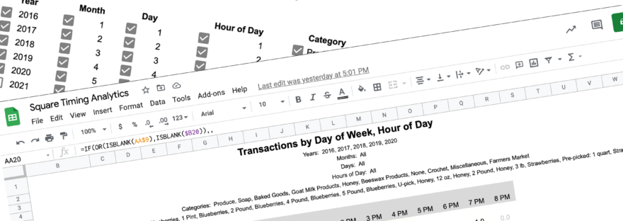
To answer these questions and guide setting business hours, I created a spreadsheet to answer 3 questions:
- How many sales occurred in each hour of an average week (all weeks overlaid)
- Was there a shift in popular hours as the season progressed?
- What was the typical pattern of sales during the first weekend of a crop? How does that compare to the second, third, etc, or holidays.
I additionally created two item-specific reports to show the most popular hours of a day or days of a week for every item.
Spreadsheet Setup
I created this in Google Sheets. You can add a blank copy of this spreadsheet to your drive here
Download CSV Data from Square
- From your Square dashboard, select Transactions
2. Then pick your timeframe for the data. The spreadsheet will allow you to filter by time period later, so unless you have a good reason to limit the input data, select an entire year at a time. (1 year is the maximum for one export)

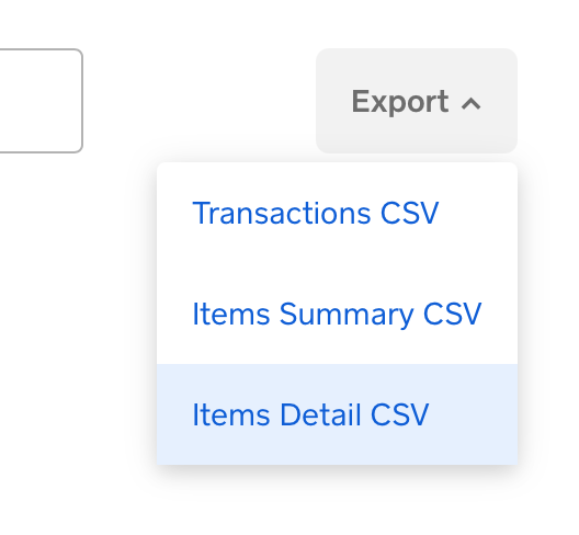
3. On the right side, click Export, and select Item Detail CSV
4. (Repeat this for as many years as you have data you want to be able to query)
Importing CSV Data to Spreadsheet
1. If you haven’t already, add a copy of the spreadsheet to your Google Drive via this link
When you open the spreadsheet, you should land on the Raw Data sheet. Columns A – J are formula helper functions, so insert the Square data starting at column K.
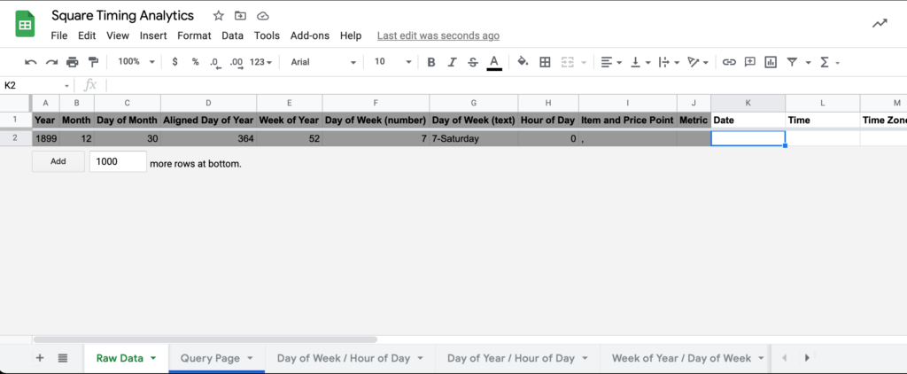
2. With K2 selected, go to File > Import > Upload, and select the CSV you downloaded from Square.
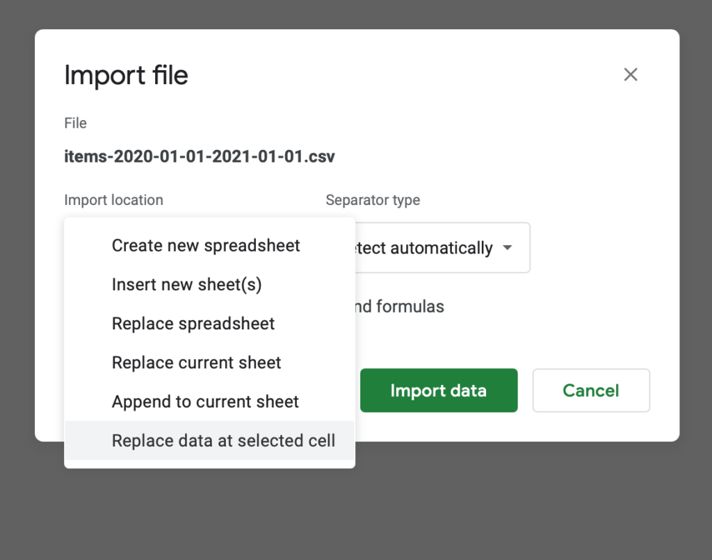
3. After the file uploads, you should see the Import file modal. For import location, select “Replace data at selected cell”. Everything else can be left as is. Click import data.
You’ll notice that the first row of the inserted data contains column labels. Double check that these map to the existing labels in the top row (but don’t delete this row yet, it has formulas that need to be copied). Square has not changed their column format in the two years since I first made this spreadsheet, but you never know. ¯\_(ツ)_/¯
4. You’ll need to copy the formulas in A2 – J2 to all the rows below. The most reliable way to do this at scale is to select A2 – J2, and copy. Then select A3, scroll all the way to bottom of the sheet, hold Shift, and select the bottom cell in column J. Now do a regular paste. This should apply the formula across all the cells without having to drag and scroll down potentially thousands of rows.
5. Delete the header row at A2.
6. Repeat this process for each CSV you need to import and remember to delete the column headings each time
Go to the Query Page sheet when you’re finished. If all has gone well, you should see each year you’ve imported under the Year list, and you should see your product categories and items/price points under the respective lists. Now you’re ready to use the querying page and reports.
Using the Spreadsheet
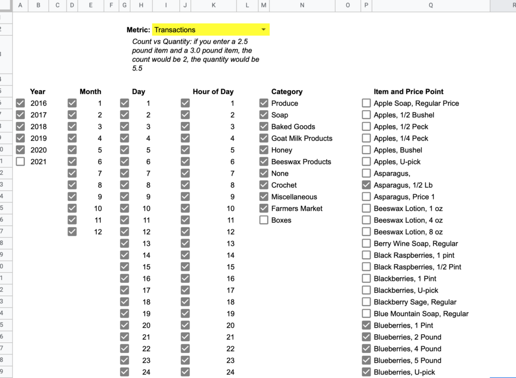
Query Page is what you’d expect- a landing page to select filters on what data you want to view. The checkbox to the left of each item includes/excludes it from the data. Depending on the size of your dataset and the kind of device you’re viewing from, filter applications could take a bit to apply, although I’m usually under a 5 second digest time with my 19,000 row dataset on a decent laptop.
The Metric dropdown controls what numbers are used in the reports: count, quantity, revenue, or transactions.
Once you’ve picked the metric you want to see and selected/unselected your filters, you can visit any of the subsequent report pages and those filters will already be applied.
These reports are all two-dimensional matrices with conditional formatting across the matrix to highlight highs/lows. There is some repetition and overlap between reports, but I’ll step through each report so you can see what each does well.
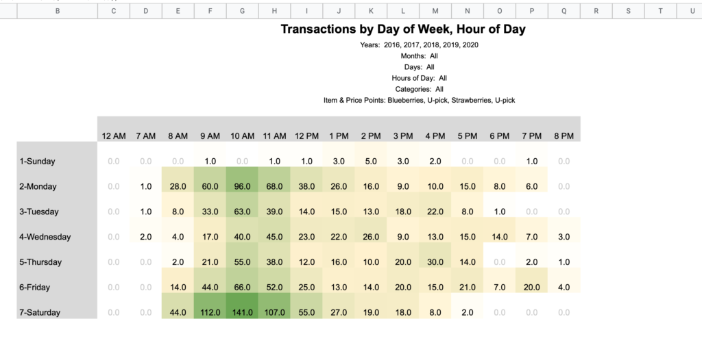
Day of Week / Hour of Day

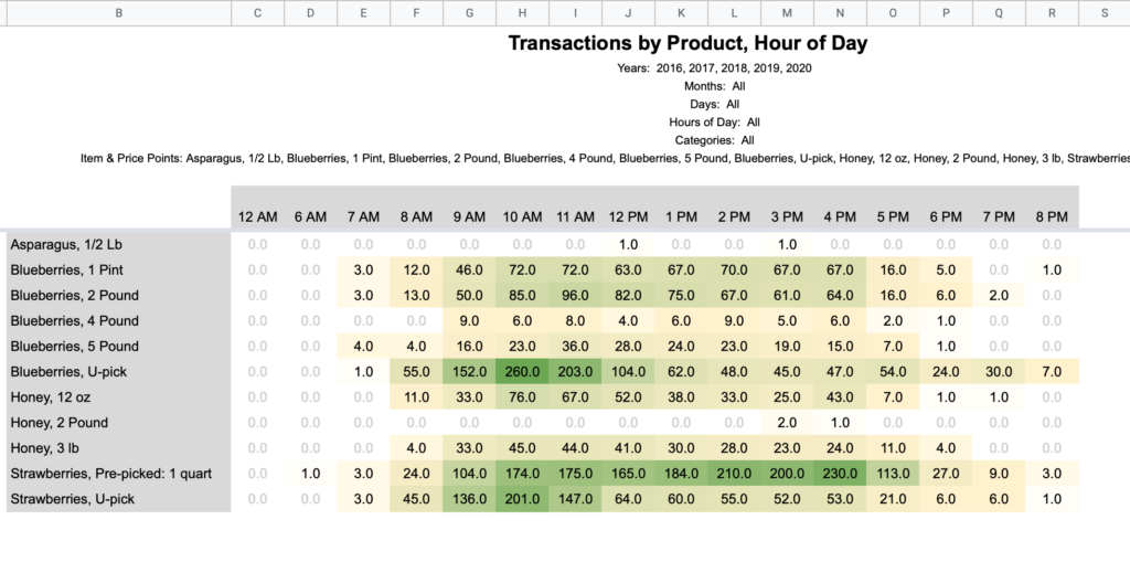
Note that the hours noted in these column headings mean the hour portion of the time. For example, 2 PM accounts for all sales from 2:00 – 2:59 PM.
Day of Year / Hour of Day
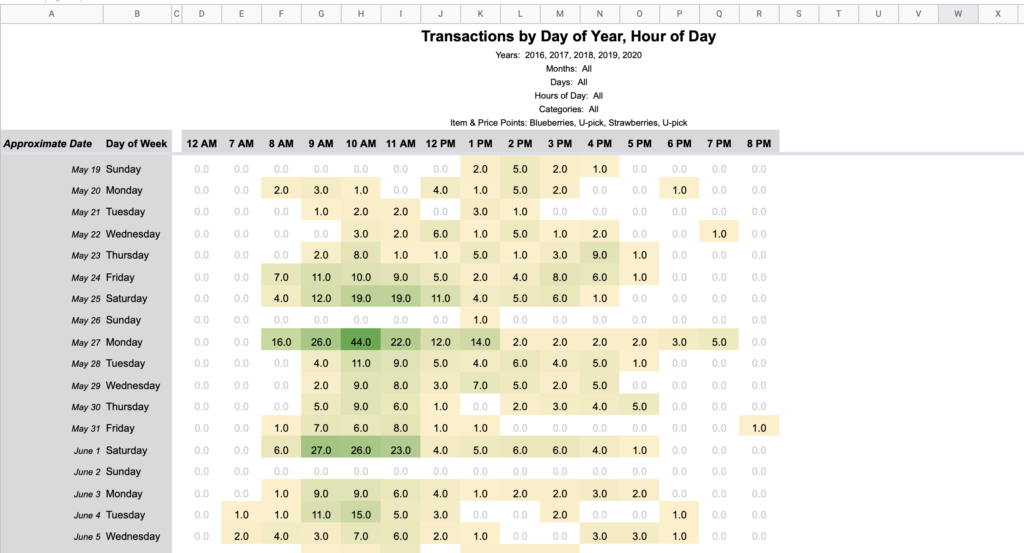
The left axis in this view is first aligned by day of week and week of year. Then after the fact, Approximate Date is calculated for an average calendar date. In our business “a Saturday in late May” means more than a literal date like “May 27th”. I’d guess this is the case for many businesses and thus being weekday centric makes sense for fair interyear comparisons.
Week of Year / Day of Week
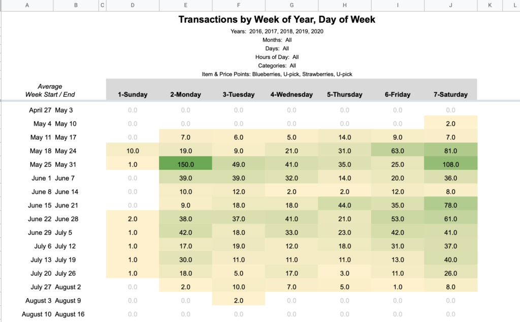
Think of this like a calendar with columns as days and rows as weeks. The same date fuzziness is at play here since these are aligned by week of year. The start/end dates listed on the left are averages, not extremes.
Product / Hour of Day
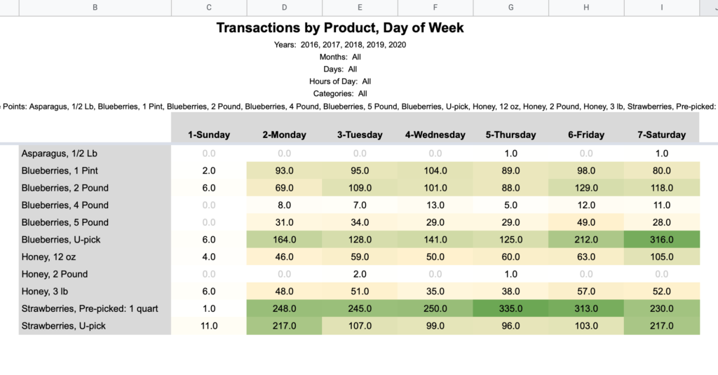
Product / Day of Week
Expansion
The report pages all reference the hidden Filtered Data sheet which is generated by applying the Query Page filters to the Raw Data sheet. If you’d like to build your own reports, referencing this Filtered Data sheet will allow you piggyback off all the built-in querying.
Pivot Table Weirdness
In this project I discovered how pivot tables in Google Sheets misbehave when the source data is changed. Specifically, if you have conditional filters applied, then delete and insert fresh data to the data range, the pivot table will not process the data until you remove and reapply the filters. I ended up rewriting my report pages (which originally used pivot tables) with a manual SUMIFS matrix so that it would reliably work when copied and populated with someone’s new data. This also drastically sped up the digest time of queries (I had load times of 60+ seconds on my 19,000 row dataset, down to under 5 seconds with the bare SUMIFS matrices).
I never went back to test a pivot table on the Filtered Data sheet as that method of filtering postdated the use of pivot tables, but you may encounter problems on reloads.